All services
Design Systems & Frontend Foundations
A production-ready Tailwind 4.0 design system, brand tokens, typography, components, data tables, and full dark mode support. Build faster, stay consistent, ship with confidence.
A production-ready Tailwind 4.0 design system, brand tokens, typography, components, data tables, and full dark mode support. Build faster, stay consistent, ship with confidence.
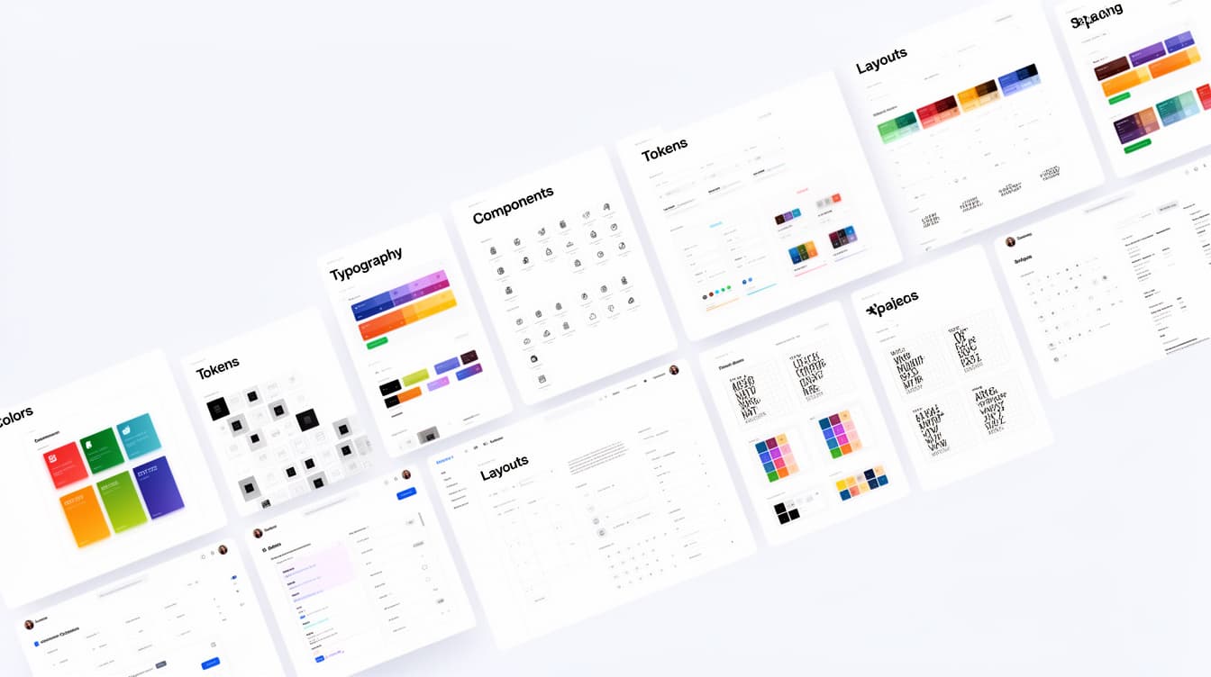
If you find yourself rebuilding the same UI foundations for every project. We can help build a production-ready design system that reflects your brand and scales with your product.
Brand-Driven Design Foundations
Your design system becomes an extension of your brand, not just another Tailwind theme. It's designed to help you start building from day one with actual usable branded functional components.
Theme Tokens Built for Scale
Structured design tokens can support multiple themed pages and sites all powered by Tailwind 4.0's modern architecture. One source of truth. Unlimited scalability.
Components Designed for Production
Buttons, inputs, selects, modals, navigation, tabs, cards, alerts, badges, command menus, and forms. Every component follows a consistent token-driven architecture for long-term maintainability.
Marketing & Typography Systems
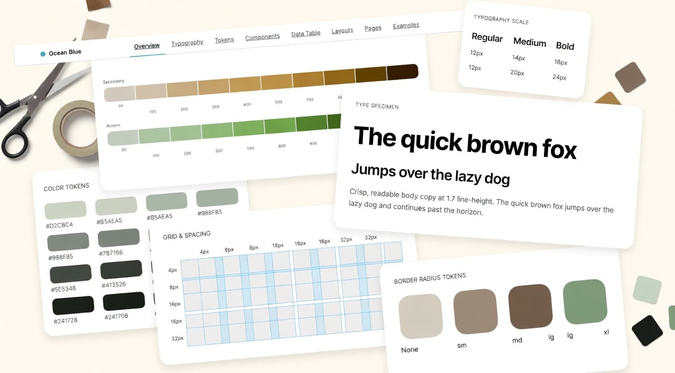
This design system was built for marketing content authors in mind and allows for complete branding using familiar typography presets that helps teams control the complete brand experience in a simplified manner.
Data Tables That Actually Scale
Not just a simplified static table with some CSS as most templates offer but a fully functional, scalable and reusable data table experience. Styling your data should be brand driven and consistent across your app and centrally manageable.
Launch Faster
Skip weeks of UI setup. Drop in a production-ready system and start building features.
Maintain Consistency
Every surface of your app should speak the same design language automatically.
Improve Developer Experience
Predictable tokens, documented patterns, and zero guesswork make development faster and more enjoyable.
Ship Light & Dark Themes
Deliver a premium experience across both modes without maintaining two separate design systems.
Scale Across Products
One system. Multiple products. Grow from a solo app to a multi-product suite without a visual rewrite.
Whether you're a startup founder who needs to move fast, a SaaS team standardizing across products, or a solo developer looking for a solid design foundation solution, we can help.
Let's connect and talk about your project. We typically respond within one business day.
Complete Dark Mode
Dark mode support is baked into the design system and not just an afterthought. Dark mode defaults are based on some of the most popular dark mode color ranges making it easier on the eyes to read.
Reduce Design Debt
Architectural consistency from the start means no expensive visual clean-up projects down the road.
We don't cut corners on the surfaces your users actually see every day.
Built specifically for the newest generation of Tailwind, with much more potential for branding flexibility. You get a design system that's future proofed and extendible.
Tailwind 4.0's token system is more flexible than earlier version and purpose-built for design systems. Better maintainability, improved theming capabilities, and reduced CSS complexity out of the box.
Less hand coding styles and configuration overhead, smarter defaults, and a design language that maps directly to your codebase your team ships UI faster from day one.
Your system grows with your product. Scale from a startup MVP to a multi-product enterprise platform without a painful rewrite, it's all in the architecture.
A complete design system that sets your project up to win from day one.
Launch a polished product without hiring a full design team. Ship with confidence from your very first commit.
Create consistency across dashboards, customer portals, and marketing sites and white label token customizations, all from a single design system.