How To Customize Flowbite React Components

Flowbite React is a great combination when using Tailwind CSS, primarily because it's based on Tailwind CSS classes and allows for full customization of React Components.
Not only does it offer some very useful components but it makes it easy to style and customize using Tailwind CSS.
In this guide, you'll find everything you need to know to get started using Flowbite React, including:
- Overview of Flowbite React components.
- How Flowbite React uses Tailwind CSS
- How to customize your own Flowbite React components.
- How to create and use a customized theme provider.
What is Flowbite React?
Flowbite React is a React based component library built on top of Flowbite and Tailwind CSS utility classes. The component library itself uses Tailwind CSS to theme and style its components, so it's very simple to override and customize.
How to install and start using Flowbite React
For this example, I'll be using the Flowbite generator, which basically uses create-react-app. I'll also cover the manual installation steps.
Using the Flowbite React generator
Running the following command will create a new app and set up everything you need automatically.
npm create flowbite-react@latest -- --template cra
Manual installation
If you don't already have an application, first create a basic React app using create-react-app as follows:
Generates a React app
npx create-react-app flowbite-cra --template typescript
cd flowbite-cra
Install dev dependencies
npm install -D tailwindcss postcss autoprefixer
Install dependencies
npm install flowbite flowbite-react
Initialize Tailwind and PostCSS
npx tailwindcss init -p
Tailwind Confguration
Add the following Tailwind directives to the main CSS file.
@tailwind base;
@tailwind components;
@tailwind utilities;
Make the following modifications to the tailwind.config.js.
If your manually installing Flowbite React, the newer versions >=8.0 support flowbite.content() and flowbite.plugin() convention from the flowbite-react/tailwind export.
Also, if you're using NPM workspaces, you'll need to set the base path if flowbite-react is installed in the root node_modules. i.e. flowbite.content({base: '../..').
const flowbite = require("flowbite-react/tailwind");
module.exports = {
content: [
'./src/**/*.{js,jsx,ts,tsx}',
flowbite.content()
],
theme: {
extend: {},
},
plugins: [flowbite.plugin()],
}
Add the following code sample and start the app npm run start and try it out.
import { Button } from "flowbite-react";

function App() {
  return (
    <div className="w-full flex justify-center p-10">
      <Button color="blue">Learning Flowbite React</Button>
    </div>
  );
}

export default App;
Getting started with Flowbite React
There are few ways to customize Flowbite React components which makes it very flexible.
Since Flowbite React is strongly typed using TypeScript it will offer a lot of code intellisense to help with customization.
Let's take for example the different ways to customize an Alert component.
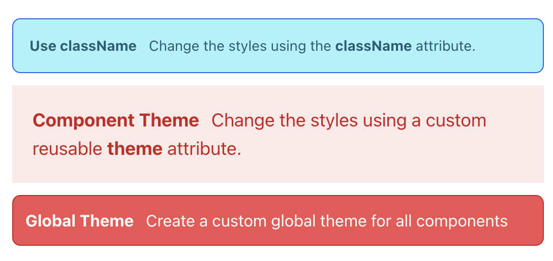
Customize using the className prop
Using the className offers a quick inline way of customizing the theme. This approach is limited and won't offer deeper nested element customization and will only apply as a general wrapper.
It's perfect for quick inline customization.
Use the className attribute
import { Alert } from "flowbite-react";

function MyPage() {
  return (
    <div className="flex justify-center flex-col p-10">
      <Alert
        color="info"
        className="bg-blue-200 border border-blue-600 text-blue-700"
      >
        <span>
          <p>
            <span className="font-bold mr-3">Use className</span>
            Change the styles using the{" "}
            <span className="font-bold">className</span> attribute.
          </p>
        </span>
      </Alert>
    </div>
  );
}

export default MyPage;
Customize using a component theme variable
Another option is to use a custom component theme exclusively for the Alert component. The idea is that it creates a reusable variable theme for a specific component type.
All Flowbite React components support the theme prop for this purpose.
In this example we can isolate the type definition using the CustomFlowbiteTheme["alert"] and define the needed theme overrides into a variable that can be reused.
Certain theme fields, like color offer the ability to create custom variant names. In this case, I'm defining a new variant called system and then setting the color prop to use it.
Use a custom reusable theme
import { Alert, CustomFlowbiteTheme } from "flowbite-react";

function MyPage() {
  const customAlertTheme: CustomFlowbiteTheme["alert"] = {
    base: "p-5 text-lg",
    color: {
      system: "border-red-500 bg-red-100 text-red-700"
    },
    rounded: "rounded-none"
  };

  return (
    <div className="flex justify-center flex-col p-10">
      <Alert color="system" theme={customAlertTheme}>
        <span>
          <p>
            <span className="font-bold mr-3">Component Theme</span>
            Change the styles using a custom reusable{" "}
            <span className="font-bold">theme</span> attribute.
          </p>
        </span>
      </Alert>
    </div>
  );
}

export default MyPage;
Customize using a global theme variable
To fully customize themes with Flowbite React you can define a global theme by using the <Flowbite> wrapper.
Although the theme variable is being defined inside the component here, it can be defined in a separate file and imported as needed.
Create a global custom theme
import { Alert, CustomFlowbiteTheme, Flowbite } from "flowbite-react";

function App() {
  const customTheme: CustomFlowbiteTheme = {
    alert: {
      base: "border p-3",
      color: {
        service: "bg-red-500 border-red-700 text-white",
      }
    },
  };

  return (
    <div className="flex justify-center flex-col p-10">
      <Flowbite theme={{ theme: customTheme }}>
        <Alert color="service">
          <span>
            <p>
              <span className="font-bold mr-3">Global Theme</span>
              Create a custom global theme for all components
            </p>
          </span>
        </Alert>
      </Flowbite>
    </div>
  );
}

export default App;
Here's the output for each of the Alert component customization code samples we just saw.
The great thing about Flowbite React is that all these options can be used together as needed, so there is a good deal of flexibility available.
Structure of a Flowbite React Theme
So now that we've seen how to use a theme, let's a take a closer look at the structure of the CustomFlowbiteTheme theme object.
Each component has a root level theme key where all of the themes settings will be located. For example.
const customTheme: CustomFlowbiteTheme = {
alert: {},
button: {},
badge: {},
card: {}
};
Now, if we expand the alert key it will have the following structure. These are all of available areas of the Alert component that can be customized using Tailwind utility classes.
const customTheme: CustomFlowbiteTheme = {
  alert: {
    base: "flex flex-col gap-2 p-4 text-sm",
    borderAccent: "border-t-4",
    closeButton: {
      base: "-m-1.5 ml-auto inline-flex h-8 w-8 rounded-lg p-1.5 focus:ring-2",
      icon: "h-5 w-5",
      color: {
        skyBlue: "bg-blue-100 text-blue-500 hover:bg-blue-200 focus:ring-blue-400 dark:bg-blue-200 dark:text-blue-600 dark:hover:bg-blue-300",
      },
    },
    color: {
      skyBlue: "border-blue-500 bg-blue-100 text-blue-700 dark:bg-blue-200 dark:text-blue-800",
    },
    icon: "mr-3 inline h-5 w-5 flex-shrink-0",
    rounded: "rounded-lg",
    wrapper: "flex items-center",
  },
};
Common theme fields
Each component has a different type structure but some of the common fields are:
base: The base is usually at the root of the component theme but can also be nested and will apply any base classes for the component as a whole or a specific nested element.color: The color object field is the same no matter how deeply nested. By default it supports the following colors:
state: info, failure, success, warningcolors: blue, cyan, dark, gray, green, indigo, light, lime, pink, purple, red, teal, yellowmode: In some cases components like button will by default support light, dark.
Theme color fields
Most of the fields are self explanitory as to what they will apply styling for but one thing to note about colors, is the following:
- The
color field can include custom field naming variants like skyBlue in this example or primary or secondary if you prefer.
- The root level
color props attribute setting will usually be used for nested elements, for example i.e. closeButton will also use skyBlue key, so it needs to also be defined at the nested level to fully customize the theme.
- The
base and color at any nested level will usually be deep merged and color will take priority.
Custom color fields
Custom color variants
const customTheme: CustomFlowbiteTheme = {
alert: {
color: {
primary: "border-gold-500 text-white dark:bg-gold-200",
secondary: "border-gray-500 text-white dark:bg-gray-200",
foo: "border-orange-500",
bar: "border-red-500"
},
closeButton: {
color: {
primary: "border-gold-500 text-white dark:bg-gold-200",
secondary: "border-gray-500 text-white dark:bg-gray-200",
foo: "border-orange-500",
bar: "border-red-500"
}
}
},
};
Using Flowbite React Dark Mode
It's become very common to be able to switch an application's theme between a light and dark mode. Flowbite React provides hooks and even a toggle button to switch modes.
By default it uses Tailwind's darkMode class setting and toggles a class on the HTML document.
<html class="dark">
    ...
</html>
Customizing Dark Mode styles
Here's a simple example of how to switch theme modes and also how to style deeply nested elements using a custom dark mode theme.
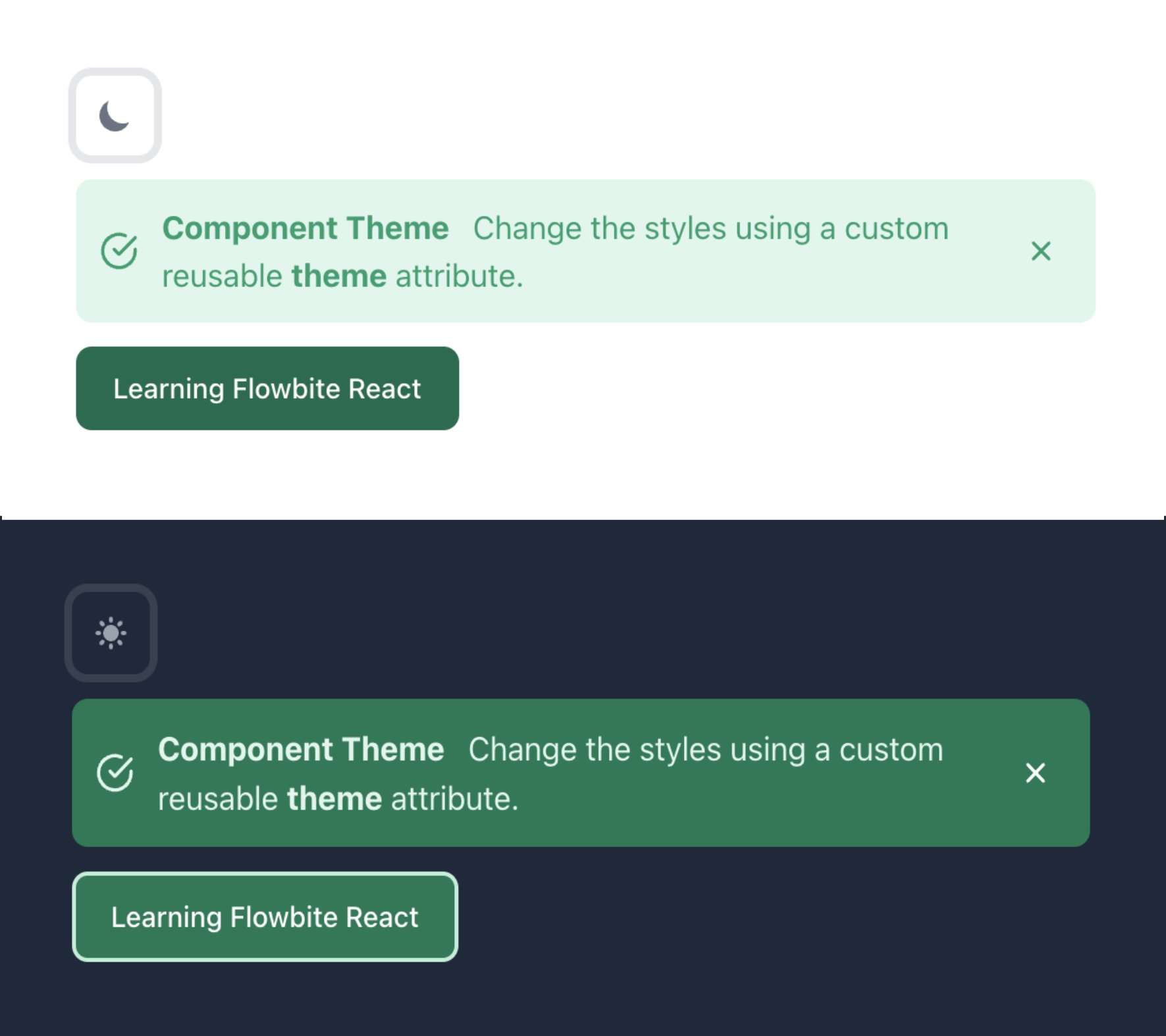
Flowbite React uses react-icons, so it will be installed as a dependency automatically.
Dark Mode Example
import { Alert, Button, CustomFlowbiteTheme, DarkThemeToggle, Flowbite } from "flowbite-react";
import { LuCheckCircle } from "react-icons/lu";
function DarkModePage() {
const customTheme: CustomFlowbiteTheme = {
alert: {
base: "p-3",
color: {
success: "bg-green-100 text-green-500 hover:bg-green-200 focus:ring-green-400 dark:bg-green-600 dark:text-green-100 dark:hover:bg-green-500",
},
closeButton: {
base: "h-8 w-8",
color: {
success: "dark:bg-inherit dark:text-white dark:hover:text-green-500"
},
icon: "bg-green-100 text-green-500 hover:text-green-600 focus:ring-green-400 dark:bg-inherit dark:text-white dark:hover:text-green-300"
}
},
button: {
color: {
primary: "border border-transparent bg-green-700 text-white focus:ring-4 focus:ring-green-300 enabled:hover:bg-green-800 dark:border dark:border-2 dark:border-green-200 dark:bg-green-600 dark:focus:ring-green-800 dark:enabled:hover:bg-green-400"
}
}
};
const onDismiss = () => {
};
return (
<Flowbite theme={{ theme: customTheme }}>
<div className="dark:bg-slate-800 flex justify-center flex-col p-10 space-y-3">
<div className="flex-auto"><DarkThemeToggle /></div>
<div className="w-full">
<Alert icon={LuCheckCircle} color="success" onDismiss={(onDismiss)}>
<span>
<p>
<span className="font-bold mr-3">Component Theme</span>
Change the styles using a custom reusable{" "}
<span className="font-bold">theme</span> attribute.
</p>
</span>
</Alert>
</div>
<div className="flex-auto">
<Button color="primary">Learning Flowbite React</Button>
</div>
</div>
</Flowbite>
);
}
export default DarkModePage;
You can also use the useThemeMode hook to create your own toggle for theme mode.
Custom dark mode toggle
import {
  Alert,
  Button,
  Flowbite,
  useThemeMode,
} from "flowbite-react";
import { LuCloudMoon } from "react-icons/lu";
import { LuCloudSun } from "react-icons/lu";
function MyPage() {
  const { mode, toggleMode } = useThemeMode();

  const changeThemeMode = () => {
    toggleMode();
  };

  return (
    <Flowbite>
      <div className="dark:bg-slate-800 flex flex-col space-y-3 p-10">
        <div className="flex-auto">
          <Button color="light" onClick={changeThemeMode}>
            {mode === "dark" ? <LuCloudSun /> : <LuCloudMoon />}
          </Button>
        </div>

        <Alert color="blue">Here's an Alert</Alert>
      </div>
    </Flowbite>
  );
}

export default MyPage;
How to apply Dark Mode themes
Notice in the success color field, that the Tailwind utility classes are mixed together with dark:{class} prefixes.
By using the dark:{class} prefix variant will let Tailwind know which classes should be applied in dark mode.
Any classes without a dark:{class} prefix variant will be applied to light mode only.
const customTheme: CustomFlowbiteTheme = {
    alert: {
      base: "p-3",
      color: {
        success: "bg-green-100 text-green-500 hover:bg-green-200 focus:ring-green-400  dark:bg-green-600 dark:text-green-100 dark:hover:bg-green-500",
      },
    }
}
In Conclusion
I hope this article has show how easy it is to create Flowbite React themes and customize components.
Flowbite React is really based on the Flowbite JavaScript library which is another useful component library which is very useful for websites that don't use a particular framework.
Here's another article you might be interested in showing how to use Flowbite and Tailwind on Astro in a standard JavaScript way. The Flowbite standard library gives absolute flexibility when it comes to theming using Tailwind CSS.