How to Style Form Inputs with Tailwind CSS Plugin

Tailwind CSS offers a complete form plugin to style all of the standard HTML input fields, however, there are times when you may need to customize these fields for your own theme or brand.
The good news is that the form plugin offers a couple strategies to customize and style Tailwind CSS form inputs.
In this article, I'll show some of the options to achieve any design theme your project might need.
Tailwind CSS framework officially provides a complete form plugin named @tailwindcss/forms, which is a full reset on all of the standard form input element styling.
It's not included by default but for those that would rather work with pure HTML input fields, it makes this possible with minimal configuration.
It provides a basic Tailwind CSS theme over standard unstyled form input elements which can vary in each browser.
With so many component libraries out there, sometimes its just easier to work with standard form input elements.
Overall, it just adds completeness to the Tailwind CSS framework.
If you're just starting out, there's a simple configuration and it requires installing the plugin first.
npm install @tailwindcss/forms
Once the plugin is installed, you need to add it to the tailwind.conf.ts configuration file.
import type { Config } from 'tailwindcss';
import twFormsPlugin from '@tailwindcss/forms';
const config: Config = {
plugins: [
twFormsPlugin,
],
};
export default config;
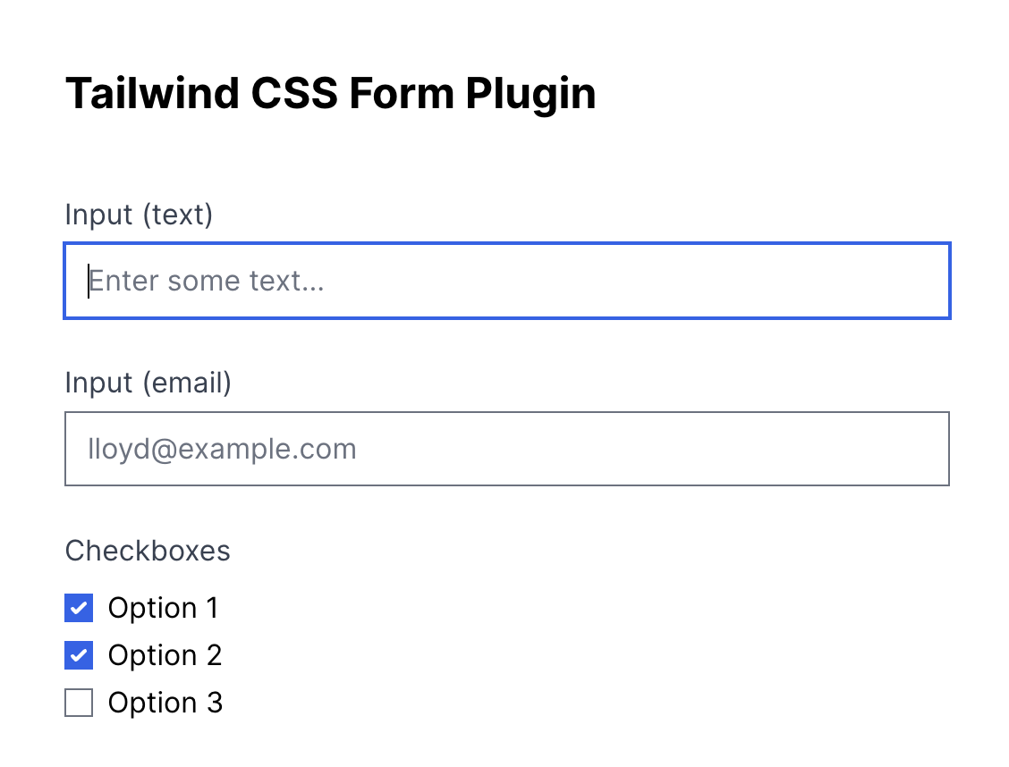
And just to make sure it's working, here's a simple form snippet you can use to verify.
 <section className="w-full mx-auto p-10 antialiased">
    <form>
      <h2 className="text-2xl font-bold mb-10">Tailwind CSS Form Plugin</h2>
      <div className="grid grid-cols-1 sm:grid-cols-12 gap-6">
        <div className="flex-col sm:col-span-8 space-y-3">
          <label>Input (text)</label>
          <input
            type="text"
            className="w-full"
            placeholder="Enter some text..."
          />
        </div>
        <div className="flex-col sm:col-span-8 space-y-3">
          <label className="">Input (email)</label>
          <input
            type="email"
            className="w-full"
            placeholder="lloyd@example.com"
          />
        </div>
        <fieldset className="block sm:col-span-8">
          <legend>Checkboxes</legend>
          <div className="mt-2">
            <div>
              <label className="inline-flex items-center">
                <input type="checkbox" />
                <span className="ml-2">Option 1</span>
              </label>
            </div>
            <div>
              <label className="inline-flex items-center">
                <input type="checkbox" />
                <span className="ml-2">Option 2</span>
              </label>
            </div>
            <div>
              <label className="inline-flex items-center">
                <input type="checkbox" />
                <span className="ml-2">Option 3</span>
              </label>
            </div>
          </div>
        </fieldset>
      </div>
    </form>
  </section>
You should see the following form fields with the default theme. In most cases these fields look pretty good already and are far better than unstyled browser default fields.
Now that the plugin is installed let's take a look at a couple options the @tailwindcss/forms provides.
The plugin can be configured to support different style strategies:
- base: Overrides the base form input fields completely using
[type=*] selectors.
- class: Only provides classes like
.form-input that can be used to style input elements.
By default the @tailwindcss/forms plugin will use the base strategy.
This might not work for certain projects and might be too opinionated or conflict with other CSS styles, so you an always configure it to only use classes like .form-input instead.
In order to toggle the strategy mode you'll need to adjust the config as follows.
plugins: [
twFormsPlugin({
strategy: 'base',
strategy: 'class',
})
],
So just as an example, if the strategy is set to base the form input field doesn't need the .form-input class added.
  <input
    type="text"
    placeholder="Enter some text..."/>
And with the class strategy, you will just need to add the .form-input class.
  <input
    type="text"
    className="form-input"
    placeholder="Enter some text..."/>
There's a couple ways to customize the input fields. I'll break it down with some examples for both cases.
The easiest approach is to use any Tailwind CSS utility classes to style the input fields. You can use this approach regardless of which strategy you choose.
For example, I'll add some utility classes to each of the form fields to create a new theme.
  <section className="w-full mx-auto p-10 antialiased">
    <form>
      <h2 className="text-2xl font-bold mb-10">Tailwind CSS Form Plugin</h2>
      <div className="grid grid-cols-1 sm:grid-cols-12 gap-6">
        <div className="flex-col sm:col-span-8 space-y-3">
          <label>Input (text)</label>
          <input
            type="text"
            className="form-input w-full rounded-md border-2 border-green-500 focus:bg-green-50 focus:text-green-500 focus:border-green-500 focus:outline-green-300 focus:ring-green-300"
            placeholder="Enter some text..."
          />
        </div>
        <div className="flex-col sm:col-span-8 space-y-3">
          <label className="">Input (email)</label>
          <input
            type="email"
            className="form-input w-full rounded-md border-2 border-green-500 focus:bg-green-50 focus:text-green-500 focus:border-green-500 focus:outline-green-300 focus:ring-green-300"
            placeholder="lloyd@example.com"
          />
        </div>
        <fieldset className="block sm:col-span-8">
          <legend>Checkboxes</legend>
          <div className="mt-2">
            <div>
              <label className="inline-flex items-center">
                <input
                  className="form-checkbox border-green-400 focus:outline-green-500 checked:text-green-500 checked:border-green-500"
                  type="checkbox"
                />
                <span className="ml-2">Option 1</span>
              </label>
            </div>
            <div>
              <label className="inline-flex items-center">
                <input
                  className="form-checkbox border-green-400 focus:outline-green-500 checked:text-green-500 checked:border-green-500"
                  type="checkbox"
                />
                <span className="ml-2">Option 2</span>
              </label>
            </div>
            <div>
              <label className="inline-flex items-center">
                <input
                  className="form-checkbox border-green-400 focus:outline-green-500 checked:text-green-500 checked:border-green-500"
                  type="checkbox"
                />
                <span className="ml-2">Option 3</span>
              </label>
            </div>
          </div>
        </fieldset>
      </div>
    </form>
  </section>
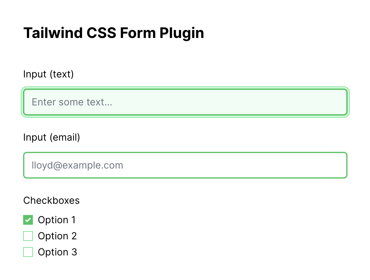
Here's what the rendered output would look like. Using utility classes can definitely help customize and theme input fields very easily.
As you can see, the HTML has become quite busy and may become hard to manage on larger forms. This strategy works when you can't use the base strategy and can only rely on the class strategy.
The downside of this approach would be:
- Harder to manage larger forms.
- Possibility of form style inconsistency.
So now let's see how we can use the base strategy to achieve the same look and feel.
By adding the following query selectors, the styles can be defined at the global scope.
Tailwind css file definition
@tailwind base;
@tailwind components;
@tailwind utilities;
input[type='text'],
input[type='email'] {
@apply rounded-md border-2 border-green-500 focus:bg-green-50 focus:text-green-500 focus:border-green-500 focus:outline-green-300 focus:ring-green-300;
}
input[type='checkbox'] {
@apply border-green-400 focus:outline-green-500;
}
input[type='checkbox']:checked {
@apply text-green-500 border-green-500;
}
Also, the form fields remain very readable and easier to scan. Any utility classes applied on the HTML fields is used only for alignment and sizing.
 <section className="w-full mx-auto p-10 antialiased">
    <form>
      <h2 className="text-2xl font-bold mb-10">Tailwind CSS Form Plugin</h2>
      <div className="grid grid-cols-1  sm:col-span-4 gap-6">
        <div className="flex-col space-y-3">
          <label>Input (text)</label>
          <input
            type="text"
            className="w-full"
            placeholder="Enter some text..."
          />
        </div>
        <div className="flex-col space-y-3">
          <label className="">Input (email)</label>
          <input
            type="email"
            className="w-full"
            placeholder="lloyd@example.com"
          />
        </div>
        <fieldset className="block">
          <legend>Checkboxes</legend>
          <div className="mt-2">
            <div>
              <label className="inline-flex items-center">
                <input type="checkbox" />
                <span className="ml-2">Option 1</span>
              </label>
            </div>
            <div>
              <label className="inline-flex items-center">
                <input type="checkbox" />
                <span className="ml-2">Option 2</span>
              </label>
            </div>
            <div>
              <label className="inline-flex items-center">
                <input type="checkbox" />
                <span className="ml-2">Option 3</span>
              </label>
            </div>
          </div>
        </fieldset>
      </div>
    </form>
  </section>
This strategy can even use variant classes to further customize. For example, a variant class .mint-green can be defined using nesting.
Tailwind css file definition
.mint-green {
input[type='text'],
input[type='email'] {
@apply rounded-md border-2 border-green-500 focus:bg-green-50 focus:text-green-500 focus:border-green-500 focus:outline-green-300 focus:ring-green-300;
}
input[type='checkbox'] {
@apply border-green-400 focus:outline-green-500;
}
input[type='checkbox']:checked {
@apply text-green-500 border-green-500;
}
}
In Conclusion
So we've seen both of the strategies for customizing Tailwind form elements using the @tailwindcss/forms plugin. The strategy you choose will vary depending on your project requirements.
If overriding the base input fields will cause some collision with other CSS or components in your app, you might need to use class strategy.
I usually opt to use mostly standard input elements these days and Tailwind definitely provides a pretty thorough plugin for the job.
Hope this article was informative.