Next.js Layouts: Maximum Flexibility

If you've decided to use Next.js on your next project, setting up your layouts should be a key initial consideration to allow for flexibility in design and avoid any refactoring down the road.
Next.js offers some very powerful layout capabilities with the ability to create highly optimized server side rendering layouts with maximimum flexibility.
In this article I'll be covering some techniques to create modularized layouts for a variety of use cases, including:
- How to create the most common layouts used in web pages today.
- How to maixmize Server Side Rendering (SSR).
- When and how to use client components.
- How to use nested layouts effectively.
What are Next.js layouts?
Next.js layouts provide a cascading and dynamic ability to create diverse page layouts to compose full HTML page templates.
The framework offers the ability to maximize SSR at the component level to optimize page load times and improve security.
Why are Next.js layouts important?
In most cases, developers are collaborating with a UX design team and design requirements may not always fit into a single layout flow. For example:
- Dashboard with a grid of cards with analytics.
- Custom landing pages like 404 and error pages.
- Full scale product promotional pages.
- Blog and documentation pages.
- Secured Admin pages based on a user's role and authentication status.
However, the most important aspects of Next.js layouts also include:
- Fetching sensitive data on the server side rather than on the client.
- Render secured menus and navigation without the need for any client logic.
- Render a bulk of page layout content on the server or even statically using
Static Site Generation (SSG).
- Greatly improve page load times with
SSR and caching.
- Reduce
Content Layout Shifting (CLS) with image and client content loading.
Types of layouts
Layouts should be easily interchangable and modular
and support a variety of use cases, rather than trying to make one layout do all the work.
Standard layout
- Main content takes up full width.
- Shows header and footer.
- Also known as single column or default layout in most cases.
Most web page templates use this layout.
Administration layout
- Main content takes up 2/3 to 3/4 of the width.
- Shows header and footer.
- Also known as two column layout.
Header
Secured Sidebar
Content
Footer
Full screen Login layout
- Main content can take up full screen if needed but floats in center of the page.
- No header or footer.
- Also known as full screen layout.
- Common design strategy for login, forgot password and registration pages.
Full screen Dashboard layout
- Main content uses the full screen width and height.
- No header or footer.
- Also known as full screen or empty layout.
- Common use case for content editors or builders or product promotion landing pages to name a few.
Prerequisites
If you don't already have Next.js installed, let's start there first.
Installing Next.js framework
npx create-next-app@latest
What is your project named? nextjs-layouts
Would you like to use TypeScript? Yes
Would you like to use ESLint? Yes
Would you like to use Tailwind CSS? Yes
Would you like to use `src/` directory? No
Would you like to use App Router? (recommended) Yes
Would you like to customize the default import alias (@/*)? No
What import alias would you like configured? @/*
Additional project directories
I'll be adding the following folders to root of the project.
/layouts: Add any layouts for the application here./components: Add any custom components here.
Since I'll be using Tailwind CSS for styling, you'll need to add the following content locations.
tailwind config
import type { Config } from "tailwindcss";
const config: Config = {
content: [
"./layouts/**/*.{js,ts,jsx,tsx,mdx}",
"./components/**/*.{js,ts,jsx,tsx,mdx}",
]
};
export default config;
Getting started with Next.js layouts
Here's an overview of the project structure I'll be using for this demo.
Project directory structure
└── project-root
    ├── app
    │   ├── (auth)
    │   │   ├── login
    │   │   │   └── page.tsx
    │   │   └── layout.tsx
    │   ├── (default)
    │   │   ├── home
    │   │   │   └── page.tsx
    │   │   ├── about
    │   │   │   └── page.tsx
    │   │   └── layout.tsx
    │   └── (secured)
    │       ├── admin
    │       │   └── page.tsx
    │       └── layout.tsx
    ├── components
    │   └── ui
    │       ├── header.tsx
    │       ├── footer.tsx
    │       └── sidebar.tsx
    └── layouts
        ├── root.tsx
        ├── default.tsx
        ├── fullscreen.tsx
        └── admin.tsx
Creating Next.js layouts
Layouts can be defined in a single file making them easy to manage. We'll create the following layouts:
root.tsx: A common base for all layouts if needed.default.tsx: Uses the standard layout flow.fullscreen.tsx: Uses the full width and height.admin.tsx: Used for secured sections typically.
Defining a base layout
We'll start by adding a base root layout, which will define the following:
- Exports the base page
metadata object with a template.
- Defines the base font,
Inter in this case.
- Adds the new
<Head> component to manage SSR header metadata.
- Only defines a
<body> tag and passes children.
Here's a more in-depth article on Next.js 14 SEO Optimation to help with the metadata object usage.
The root.tsx layout should serve as a common layout.
import React, { PropsWithChildren } from 'react';
import Scripts from '@/components/ui/scripts';
import Head from 'next/head';
import { Inter } from 'next/font/google';
import { Metadata } from 'next';

export const metadata: Metadata = {
  title: {
    template: '%s | Website Name',
    default: 'Website Name',
  },
  description: 'Your website description here.',
};

const inter = Inter({
  subsets: ['latin'],
  variable: '--font-inter',
  display: 'swap',
});

export const RootLayout = ({ children }: PropsWithChildren) => {
  return (
    <html lang="en">
      <Head>
        <meta charSet="utf-8" />
        <meta name="viewport" content="width=device-width, initial-scale=1" />
        <link rel="icon" type="image/x-icon" href="/favicon.ico"></link>
        <link rel="canonical" href="example.com"></link>
      </Head>
      <body className={`${inter.className}`}>
        {children}
        <Scripts />
      </body>
    </html>
  );
};

export default RootLayout;
Adding JavaScript libraries
This will set an insertion point for any <script> tags needed in your app. You can also use the import JavaScript ESM approach too.
import React from "react";
const Scripts = () => {
return <>
{}
{}
</>
};
export default Scripts;
Here are the rest of layouts. Some of them use some providers which I'll explain in the next section since it's important to define providers correctly in React Server Components (RSC).
Default layout
import React, { PropsWithChildren } from 'react';
import RootLayout from './root';
import Footer from '@/components/ui/footer';
import Header from '@/components/ui/header';
import Scripts from '@/components/ui/scripts';
import { AppProvider } from '@/components/provider/app';
import { ThemeProvider } from '@/components/provider/theme';
import '@/app/globals.css';

export const DefaultLayout = ({ children }: PropsWithChildren) => {
  return (
    <RootLayout>
      <AppProvider value={{accountId: "12345"}}>
        <ThemeProvider value={{theme: "dark"}}>
          <Header />
          <div className="h-[calc(100vh-130px)]">{children}</div>
          <Footer />
          <Scripts />
        </ThemeProvider>
      </AppProvider>
    </RootLayout>
  );
};
Admin layout
import React, { PropsWithChildren } from 'react';
import RootLayout from './root';
import Footer from '@/components/ui/footer';
import Header from '@/components/ui/header';
import Scripts from '@/components/ui/scripts';
import Sidebar from '@/components/ui/sidebar';
import { AppProvider } from '@/components/provider/app';
import { ThemeProvider } from '@/components/provider/theme';
import '@/app/globals.css';

export const AdminLayout = ({ children }: PropsWithChildren) => {
  return (
    <RootLayout>
      <AppProvider value={{ accountId: '12345' }}>
        <ThemeProvider value={{ theme: 'dark' }}>
          <Header />
          <div className="h-[calc(100vh-130px)] grid grid-cols-1 sm:grid-cols-12 gap-7">
            <div className="sm:col-span-4">
              <Sidebar />
            </div>
            <div className="sm:col-span-8">{children}</div>
          </div>
          <Footer />
          <Scripts />
        </ThemeProvider>
      </AppProvider>
    </RootLayout>
  );
};
Full screen layout
import React, { PropsWithChildren } from 'react';
import RootLayout from './root';
import Scripts from '@/components/ui/scripts';
import '@/app/globals.css';

export const FullscreenLayout = ({ children }: PropsWithChildren) => {
  return (
    <RootLayout>
      <div className="h-screen">{children}</div>
      <Scripts />
    </RootLayout>
  );
};
Layout components
Here's the code for the components, <Header>, <Footer> and <Sidebar> components. These are just generic components and only to show sections of the layout.
import React from 'react';

const Header = () => {
  return (
    <header className={`flex justify-center items-center p-5 bg-blue-500`}>
      Header
    </header>
  );
};

export default Header;
import React from 'react';

const Footer = () => (
  <footer className="flex justify-center items-center p-5 bg-gray-500">
    Footer
  </footer>
);

export default Footer;
export default function Sidebar() {
  return (
    <div className="flex justify-center items-center h-full min-h-40 bg-slate-400">
      Sidebar
    </div>
  );
}
export default Sidebar;
How to use React providers in layouts
Most third party providers you might already use are not React Server Component RSC ready. This means that they don't add the use client to indicate to run on the client.
Since layouts are RSC by default, they need to be placed in a separate module file and declared as client component using use client.
Here's some examples.
'use client';

import { PropsWithChildren, createContext } from 'react';

export type AppState = {
    accountId?: string;
};
export const AppContext = createContext<AppState>({
    accountId: undefined
});

export type AppProviderProps = {value: AppState} & PropsWithChildren;

export const AppProvider = function ({value, children}: AppProviderProps) {
  return (
    <AppContext.Provider value={value}>{children}</AppContext.Provider>
  );
};
'use client';

import { PropsWithChildren, createContext } from 'react';

export type ThemeProps = {
  theme?: string;
};
export const ThemeContext = createContext<ThemeProps>({
  theme: 'dark',
});

export type ThemeProviderProps = {value: ThemeProps} & PropsWithChildren;

export const ThemeProvider = function ({ value, children }: ThemeProviderProps) {
  return <ThemeContext.Provider value={value}>{children}</ThemeContext.Provider>;
};
Using the new layouts in pages
In order to use one of the layouts for a particular page route, we can use Next.js Route Groups to segment and group layouts.
Using the parenthesis (path) notation in the route path, tells Next.js to group the nested pages and routes into a group with the same layout.
By removing the /app/layout.tsx in the root of the app route directory, Route Groups will use the layout.tsx inside the Route Group directory as its root.
- (auth): Used for pages like login.
- (default): Use for general web pages.
- (secured): Used for authenticated admin page.
Page Route Groups Section
└── project-root
    └── app
        ├── (auth)
        │   ├── login
        │   │   └── page.tsx
        │   └── layout.tsx
        ├── (default)
        │   ├── home
        │   │   └── page.tsx
        │   ├── about
        │   │   └── page.tsx
        │   └── layout.tsx
        └── (secured)
            ├── admin
            │   └── page.tsx
            └── layout.tsx
These are just examples used in this tutorial but you can group pages and layouts in anyway you need.
The main idea is the pattern for applying layouts using the Route Group notation.
Using the (default) route group layout
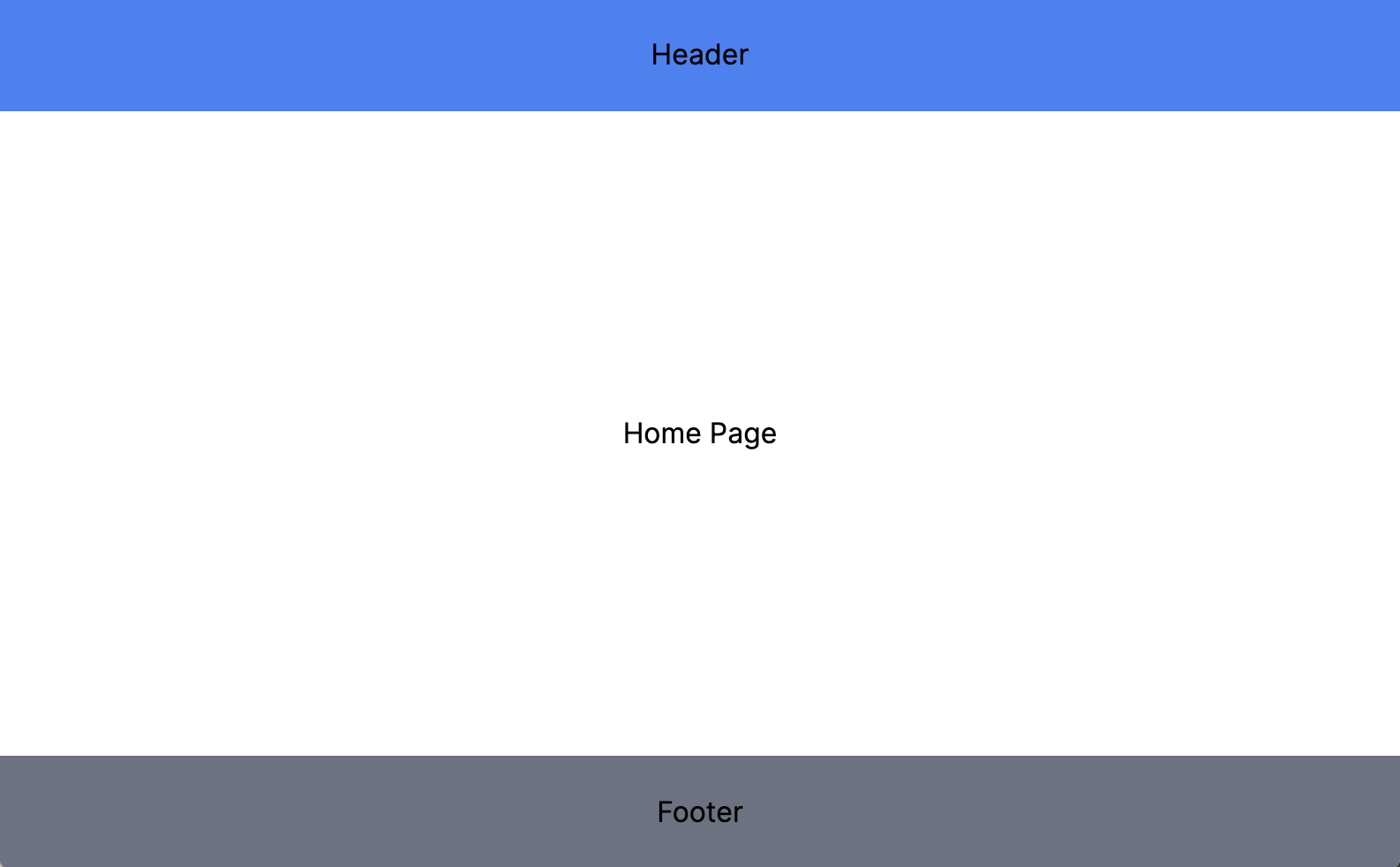
Here's an example of how to use the DefaultLayout defined earlier.
import React, { PropsWithChildren } from 'react';
import {DefaultLayout} from '@/layouts/default';

export default function Layout({ children }: PropsWithChildren) {
  return <DefaultLayout>{children}</DefaultLayout>;
}
import { Metadata } from 'next';

export const metadata: Metadata = {
  title: 'Home Page',
};

export default function Home() {
  return <div className="h-full flex justify-center items-center">Home Page</div>;
}
HTML Output:
localhost:3000/home
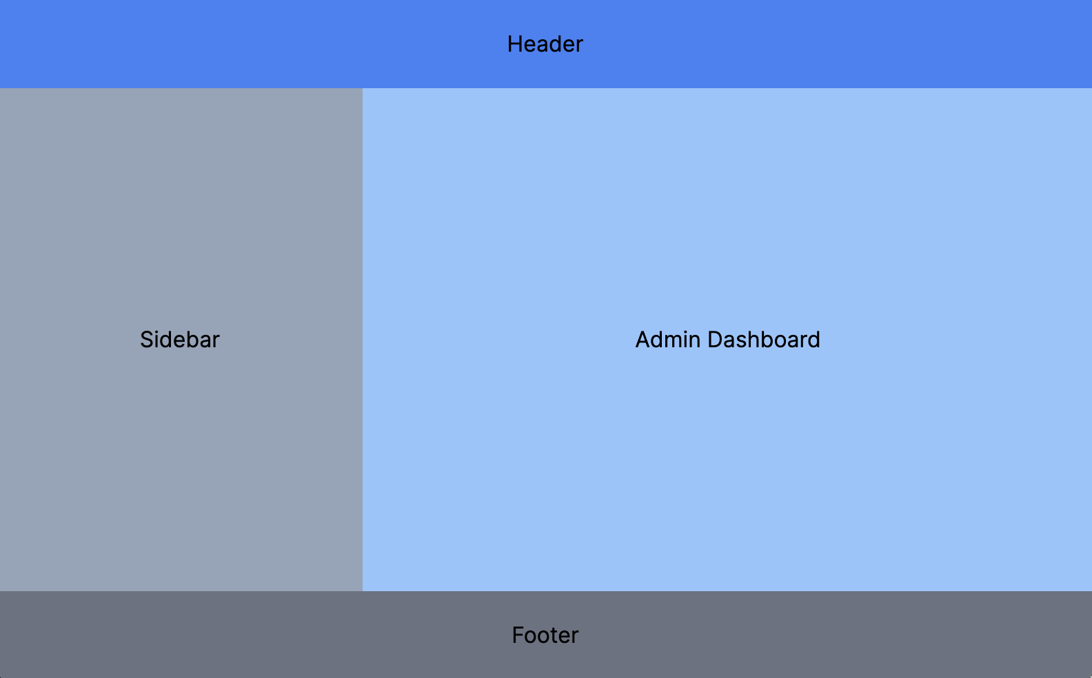
Using the (secured) route group layout
Here's an example of how to use the AdminLayout defined earlier.
import React, { PropsWithChildren } from 'react';
import { AdminLayout } from '@/layouts/admin';

export default function Layout({ children }: PropsWithChildren) {
  return <AdminLayout>{children}</AdminLayout>;
}
import { Metadata } from "next";

export const metadata: Metadata = {
  title: 'Admin Dashboard',
};

export default function Admin() {
  return (
    <div className="flex justify-center items-center h-full bg-blue-300">
       Admin Dashboard
    </div>
  );
}
HTML Output:
localhost:3000/admin
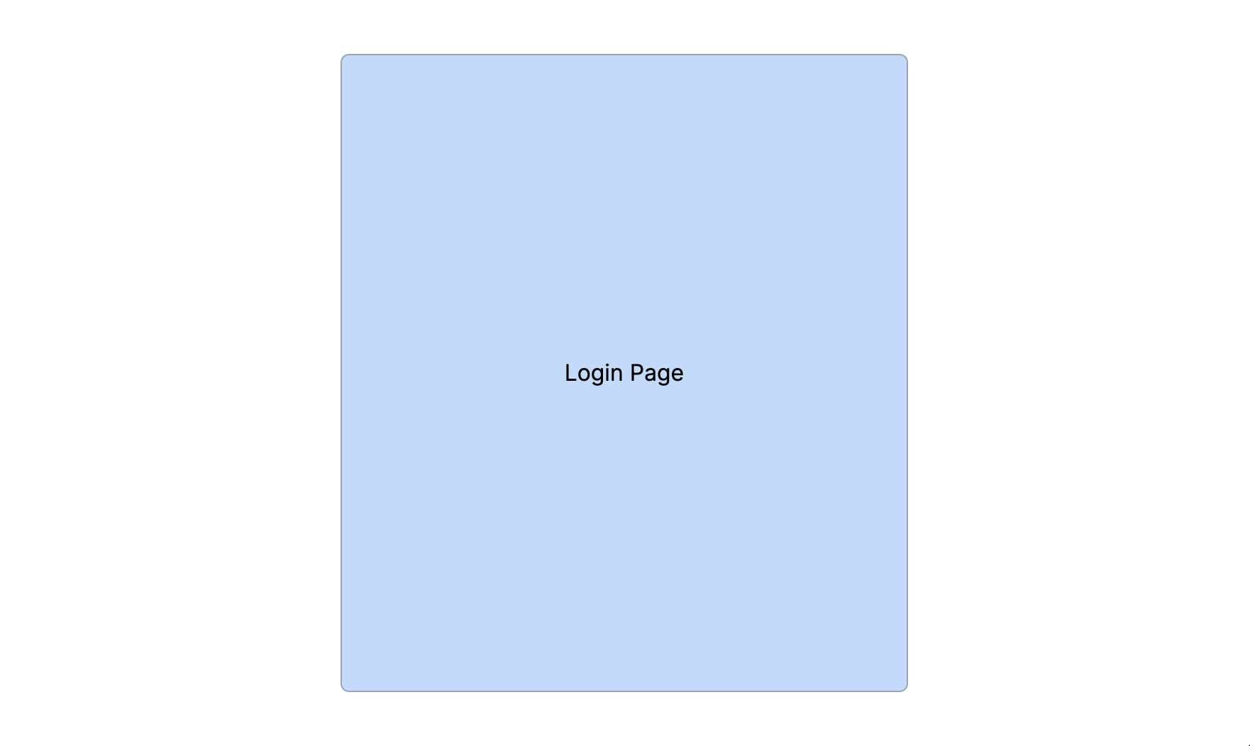
Using the (auth) route group layout
Here's an example of how to use the FullscreenLayout defined earlier.
import React, { PropsWithChildren } from 'react';
import { FullscreenLayout } from '@/layouts/fullscreen';

export default function Layout({ children }: PropsWithChildren) {
  return <FullscreenLayout>{children}</FullscreenLayout>;
}
import { Metadata } from 'next';

export const metadata: Metadata = {
  title: 'Login',
};

export default function Login() {
  return (
    <div className="h-full flex justify-center items-center">
      <div className="flex justify-center items-center w-[400px] h-[450px] rounded-md border border-gray-400 bg-blue-200 p-5">
        Login Page
      </div>
    </div>
  );
}
HTML Output:
localhost:3000/login
How to maximize SSR with layouts
It's important to start thinking from a server side first perspective when creating layouts and components. This will maximize how much code is rendered on the server and improve performance.
Here's a couple of guidelines:
Isolate client component logic
One thing to note here is that all the pages so far are RSC. Since the metadata object can only be exported from server component, it's best to keep page.tsx files as server components if possible.
Since most client UI components will want to use React hooks, you'll want to extract the client code into separate components to isolate the client logic.
This way the client component can contain all of the hooks and interactivity and the page.tsx can render as much on the server as possible.
Try to put as much static content inside of server components.
For example.
import { Metadata } from 'next';
import {LoginForm} from '@/components/ui/forms';
export const metadata: Metadata = {
title: 'Login',
};
export default function Login() {
return (
<div className="h-full flex justify-center items-center">
<div className="flex justify-center items-center w-[400px] h-[450px] rounded-md border border-gray-400 bg-blue-200 p-5">
{}
<LoginForm />
</div>
</div>
);
}
Fetch data on the server side
Leverage server components to do the heavy lifting and fetch all the needed data on the server side and simply pass it into client components.
Also, try to keep client components as leaf or dumb components. Try to avoid importing RSC server components from within them.
Think of server components as cascading data down into client components.
import { Metadata } from 'next';
import MarketingDashboard from '@/components/ui/marketing';

export const metadata: Metadata = {
  title: 'Home Page',
};

export default async function Home() {
  async function getData() {
    const res = await fetch('/api/marketing/promos');

    if (!res.ok) {
      throw new Error('Could not load data');
    }

    return res.json();
  }

  const data = await getData();

  return (
    <div className="h-full flex justify-center items-center">
      <MarketingDashboard data={data} />
    </div>
  );
}
Decide what a user has access to by building menus and navigation links on the server.
In this example, the Sidebar is a server component that passes a menu items list to a client component based on a users permissions.
All of this happens on the server rather than the client, so there's no need to expose any role validation logic in the client on the browser.
Secured SidebarMenu
import { SidebarMenu } from '@/components/ui/menus';
import { userInRoles, useSession } from '@/lib/security';
export default async function Sidebar() {
const { user } = useSession();
function getMenuItems() {
const publicMenu = [
{
id: '4',
label: 'Store',
url: '/store',
},
{
id: '4',
label: 'Blog',
url: '/blog',
},
];
const securedMenu = [
{
id: '4',
label: 'Admin',
url: '/secured/account',
},
];
const menu = [
...publicMenu,
userInRoles(user, ['Admin']) && { ...securedMenu },
];
return menu;
}
const menu = getMenuItems();
return (
<div className="h-full flex justify-center items-center">
<SidebarMenu menuItems={menu} />
</div>
);
}
These are just a few techniques but the benefit of leveraging layouts and other server components to do a bulk of the processing allows client components to focus on the presentation tier.
In Conclusion
So hopefully you'll have a better grasp on what's possible with the latest versions of the Next.js framework regarding layouts.
Next.js definitely makes it easy to create flexible and modularized layouts to meet any design requirements.
These are some of the layout strategies I use on my own projects and I've really streamlined things to make it as light weight and modular as possible.
Creating layouts should be easy and fast. Hope you enjoyed.