Create Custom Forms Using Payload CMS Form Builder Plugin
Posted on: August 11 2025

One of the most essential features of any web app is the ability to quickly create and manage custom forms, like contact forms, surveys, opt-ins or sign-ups. The Payload CMS Form Builder plugin provides a powerful solution that lets you easily create and manage forms directly from the admin panel.
In this post, I'll walk through how to install and use the Form Builder plugin to start creating and collecting form data in a few easy steps.
I'll be covering the following:
- What is the Payload Form Builder plugin?
- How to install the Form Builder plugin
- How to build any type of form
- How to customize form fields
- Validating fields
- Submitting and viewing form data
- Adding forms to pages
Mastering this plugin can be game changing and it provides so much potential for business and marketing benefits to be able to reach customers in very creative ways.
So, let's start building forms like a pro.
The Form Builder plugin is one of the key Payload CMS plugins and is quite useful once you learn how it functions.
The plugin creates two new Collections, the forms and forms-submissions. These two Collections provide a way to efficiently define, submit and collect form data.
- forms: Defines forms and the fields that are needed.
- form-submissions: Collects and receives submitted form field data and sends any success confirmation emails defined in a given form.
Both of these Collections can be customized as needed in the plugin config settings.
There's only one dependency that's really needed but I'm also going to use the react-hook-form package for its awesome form validation.
pnpm add @payloadcms/plugin-form-builder react-hook-form
You can also use the Payload generator which will install everything you need with some working examples.
npx create-payload-app
In this post, I'll take a step by step approach and build the components needed to better explain how the plugin actually works.
The plugin provides the following options to enhance the default settings:
- beforeEmail: A function callback to modify email content before they're sent.
- defaultToEmail: The default To: email address if none is specified in the form instance.
- fields: Indicates which block input fields are selectable and available to use in forms.
- formOverrides: form Collection overrides.
- formSubmissionOverrides: form-submission Collection overrides.
- handlePayment: A function handler for payment processing.
- redirectRelationships: An array of redirect string.
This post will only focus on building forms and won't be covering any payment processing flows.
I may do a follow-up post to cover the handlePayment flow since there is a great deal of benefits and use cases.
I'll hide the option for paymnents by setting it to false in the config.
export default buildConfig({
plugins: [
formBuilderPlugin({
fields: {
payment: false,
},
formOverrides: {
fields: ({ defaultFields }) => {
return [
...defaultFields,
]
},
},
}),
],
})
The plugin defines some default field block types for input elements.
- Text
- Textarea
- Select
- State
- Country
- Checkbox
- Email
- Message
You can define any custom fields needed but these basic fields usually cover most form use cases.
Any fields that are defined are Block layout fields to hold the form data but will still need a React UI facing component to actually render the data for a field.
A Newsletter signup example
To demonstrate how to create a form, I'll create a simple newsletter opt-in form to handle new subscribers.
The form will consist of three input fields.
- Full Name
- Email
- Checkbox - Send me updates on new products
Here's what the form will look like embeded within a full page.

Now that the plugin is installed, you'll see some new Collections in the admin section named Forms and Form Submissions.
The Forms Collection is used to create and add forms. To create a new form just click on the Create New button in the Forms section.
Each form has the following settings to define a form.
- Title: The form title
- Fields: A list of input field definitions with a selectable block type, which determines how the field will be rendered.
- Submit Button Label: The label on the submit button.
- Confirmation Type: Either a direct rich text message to show after the form is submitted or a redirect url to a success page.
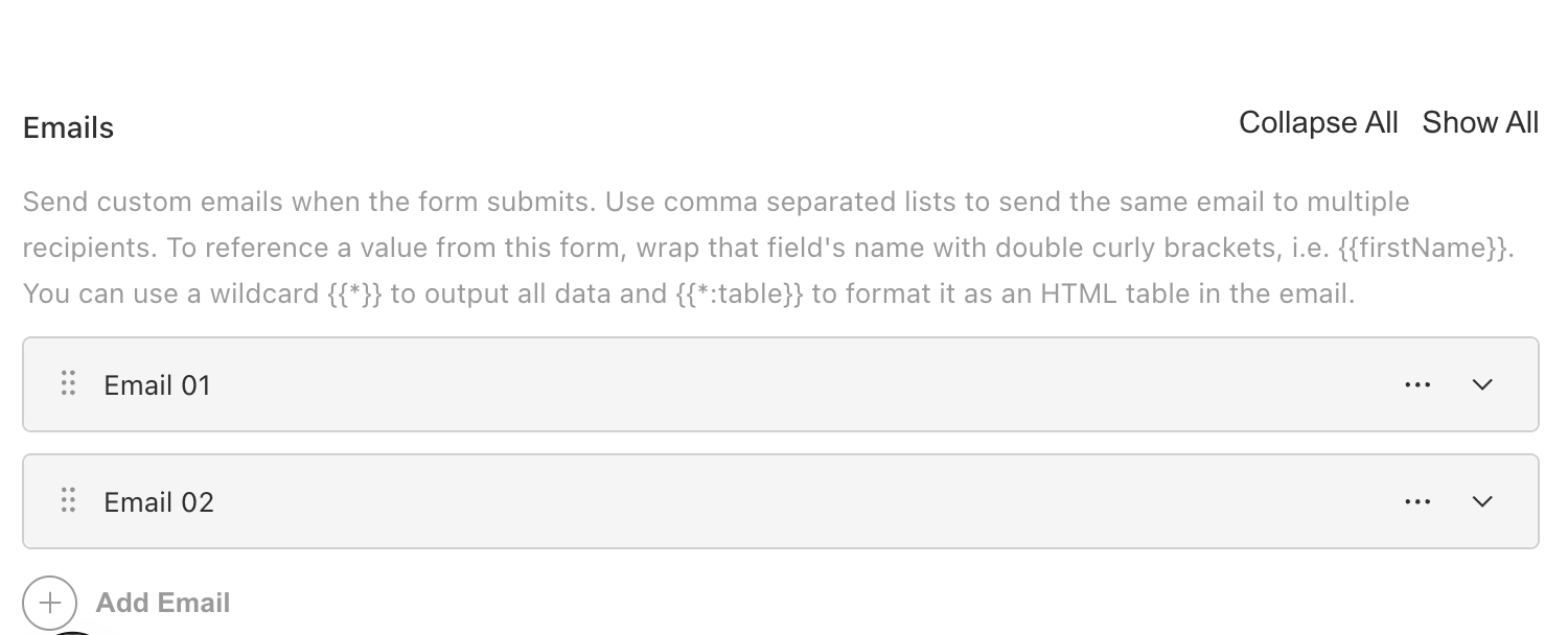
- Emails: A list of emails to send out to users or internal on submit.
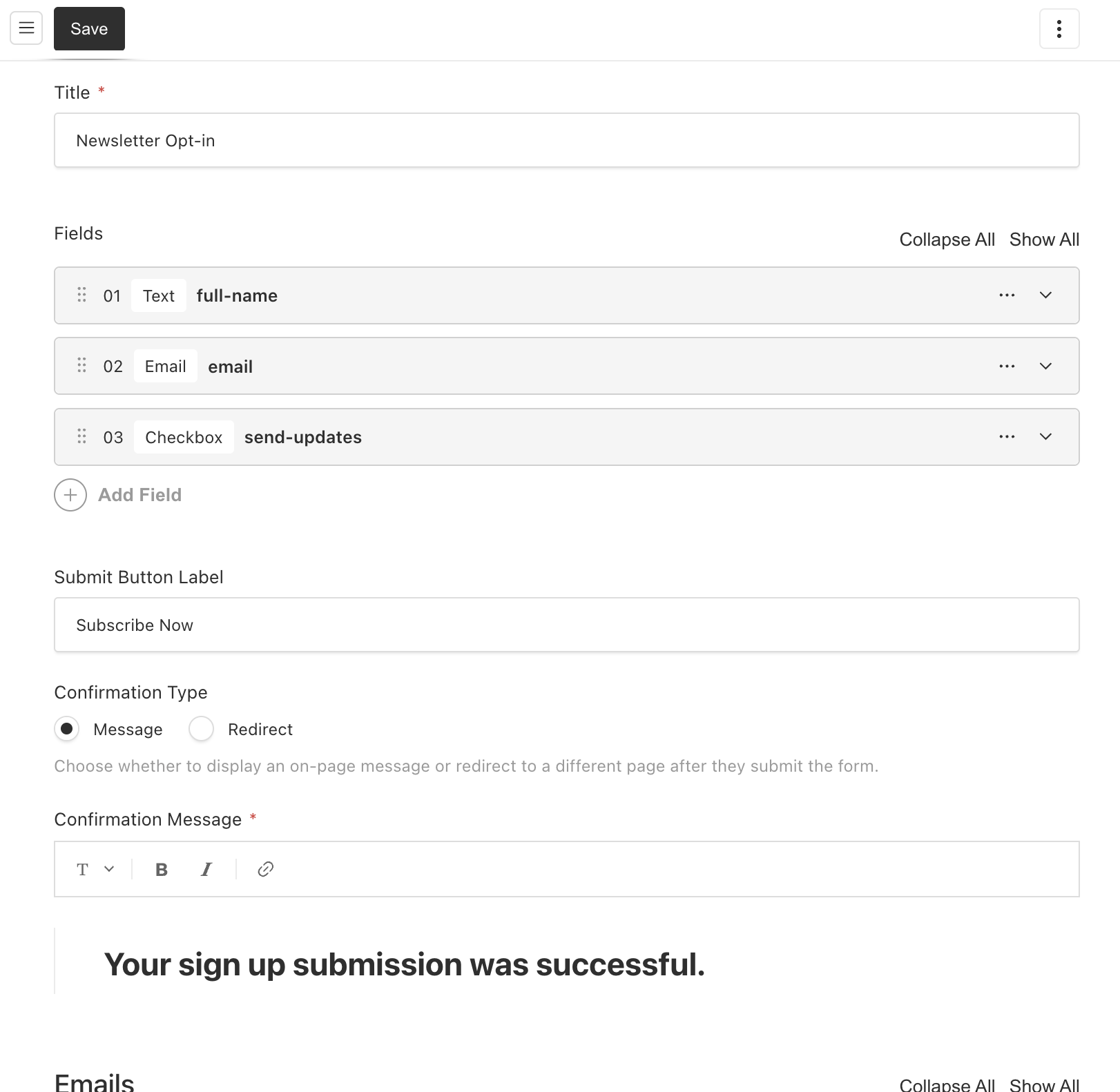
Confirmation type messages
The Confirmation Type setting determines what a user will see on a form submission.
Typically this is a success page after the form is submitted or maybe even a paywall page or message.
I'll set the Confirmation Type to a rich text message for now but this could also redirect to a specific page if needed.
Add confirmation emails
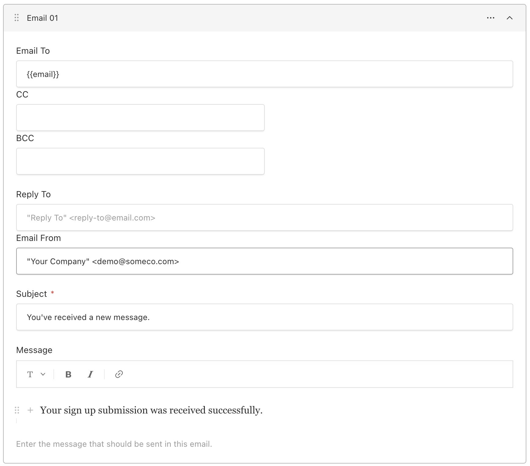
The last field adds any emails that should be sent out on submit. The plugin will automatically send out any emails that have been added to the form.
Customize email messages with variables
Each email supports placeholder syntax variables from the submitted form data.
For example, to send a confirmation email to a user, simply use the email field in the form data.
To: {{email}}

Hello {{full-name}},

Thank you for subscribing...
You can essentially define as many emails as needed and compose the emails using form data variables to add personalized messages for a better user experience.
Here's a sample email response form.
Before email send hook
Use the beforeEmail hook in the plugin config, to further customize email responses just before they are sent.
The hook provides a reference to a form's email list and the beforeChangeParams which are passed to the callback from the beforeChange hook's args on form-submissions.
payload.config.ts
formBuilderPlugin({
beforeEmail: (emailsToSend, beforeChangeParams) => {
return emails.map((email) => ({
...email,
html: doSpecialFormat(email.html),
}))
},
})
So if you're new to Payload CMS Blocks, then it's important to know that in order to actually use the new form that was just created, we'll need some UI components.
- Form blocks: A React component to iterate and render a form's fields.
- Form field blocks: A React component to render each input field as HTML elements.
This is actually where you can customize how your form and input fields are styled. In this demo, I'm going to use only HTML which will be easier to grasp the concept.
One of the key features in Payload CMS is its powerful block layouts. The fields array is an array of blocks and so is each field in itself.
Forms are going to be really effective, when they are added in page level block layouts.
Block layouts provide the following advantages:
- Can be dynamically added to a page.
- Provides a relationship dropdown to select the form rather than writing custom code to fetch a form by ID, which makes it ideal for content authors.
- Can place additional block content before or after the form to enhance the page.
Best practices for layout blocks
Whenever, I'm building block level components, I'll use a co-location directory structure to make things a bit more modular. This way the config code can live near the UI code and it's not all spread about.
Sample block using separate folder for sub-component fields.
└── src
    └── blocks
        └── Form
            ├── Text
            │   └── index.tsx
            ├── Checkbox
            │   └── index.tsx
            ├── config.ts
            └── index.tsx
For this example, I'll keep things simple and put each field block component in a single file called fields.ts.
Sample block component directory structure.
└── src
    └── blocks
        └── Form
            ├── config.ts
            ├── fields.ts
            └── index.tsx
Payload blocks need a block level configuration to inform Payload of what fields your component will use.
Here's the configuration for the FormBlock component we'll create:
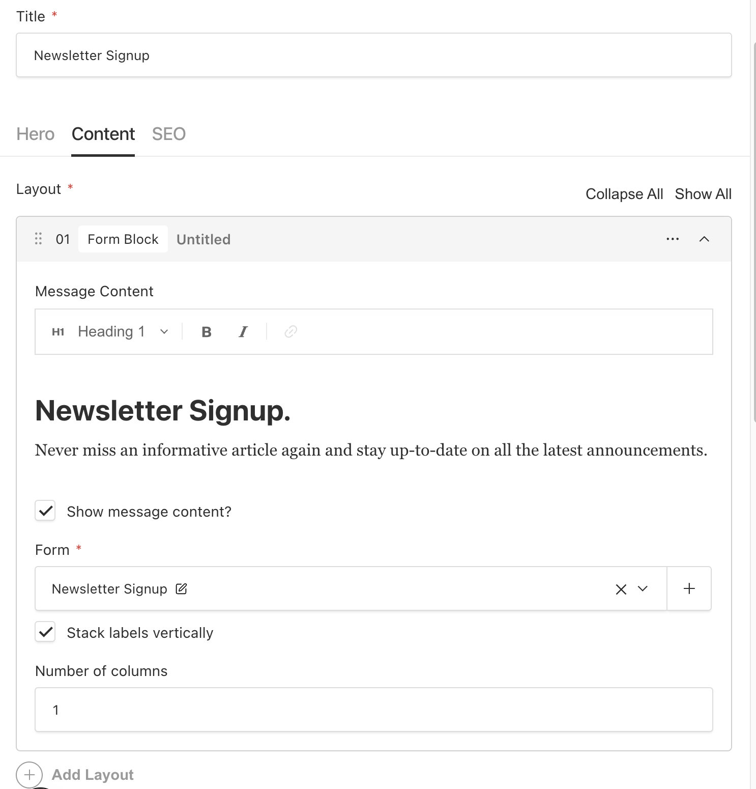
- content: Rich text content used to provided a message to users regarding the forms intent.
- showContent: Toggle show/hide the content field if needed without having to change code.
- form: The form relationship and form selection dropdown.
- stacked: Whether labels and inputs are stacked vertically or horizontal.
- columns: How many grid columns the form should use, defaults to 1.
Simple form block config.
import type { Block } from 'payload'
export const FormBlock: Block = {
slug: 'formBlock',
interfaceName: 'FormBlock',
fields: [
{
name: 'content',
type: 'richText',
label: 'Message Content',
},
{
name: 'showContent',
type: 'checkbox',
label: 'Show message content?',
},
{
name: 'form',
type: 'relationship',
relationTo: 'forms',
required: true,
},
{
name: 'stacked',
label: 'Stack labels vertically',
type: 'checkbox',
},
{
name: 'columns',
label: 'Number of columns',
type: 'number',
defaultValue: 1,
},
],
graphQL: {
singularName: 'FormBlock',
},
labels: {
plural: 'Form Blocks',
singular: 'Form Block',
},
}
The FormBlock client component, will actually render and submit the submissionData to the forms-submissions API.
Let's break down what this component is going to do.
- Receives a reference to the form relationship field.
- Loops through each of the form's fields and renders a block which is mapped by blockType.
- Adds react-hook-form for validation.
- Adds a submit button with label.
- Sends form-submissions using a POST
- Uses stacked and columns to add some CSS for different form visual layouts.
Each field (which are also blocks) is mapped by its blockType key, i.e. text, textarea, checkbox, etc.
Payload block types have a blockName and blockType field to help identify each block.
...
const { id, blockType } = field
const Block = fields[blockType]
...
This is a very common technique when using blocks, is to loop through and generate content.
Here's the full code for the FormBlock.
'use client'

import { FormProvider, useForm } from 'react-hook-form'
import { Form, FormFieldBlock } from '@payloadcms/plugin-form-builder/types'
import { useCallback, useState } from 'react'
import { useRouter } from 'next/navigation'
import RichText from '@/components/RichText'
import { fields } from './fields'
import { SerializedEditorState } from '@payloadcms/richtext-lexical/lexical'

export type FormBlockType = {
  blockName?: string
  blockType?: 'formBlock'
  form: Form
  content?: SerializedEditorState
  showContent?
  stacked?: boolean
  columns?: number
  className?: string
}

export function FormBlock({
  form: formProps,
  form: { id: formID, confirmationType, redirect, confirmationMessage, submitButtonLabel },
  stacked = true,
  columns = 1,
  content,
  showContent
}: FormBlockType) {
  const formMethods = useForm({
    defaultValues: formProps.fields,
  })
  const {
    control,
    formState: { errors },
    handleSubmit,
    register,
  } = formMethods
  const [isLoading, setIsLoading] = useState(false)
  const [hasSubmitted, setHasSubmitted] = useState<boolean>()
  const [error, setError] = useState<{ message: string; status?: string } | undefined>()
  const router = useRouter()

  const { title } = formProps
  const formColSpans = Array(12)
    .fill('')
    .reduce((acc, col, index) => {
      const spanSize = Number(index + 1)
      acc[spanSize] = `col-span-${spanSize}`
      return acc
    }, {})

  const formColSpan = formColSpans[12 / columns]

  const onSubmit = useCallback(
    (data: FormFieldBlock[]) => {
      const submitForm = async () => {
        setError(undefined)

        const dataToSend = Object.entries(data).map(([name, value]) => ({
          field: name,
          value,
        }))

        try {
          const req = await fetch(`${process.env.NEXT_PUBLIC_SERVER_URL}/api/form-submissions`, {
            body: JSON.stringify({
              form: formID,
              submissionData: dataToSend,
            }),
            headers: {
              'Content-Type': 'application/json',
            },
            method: 'POST',
          })

          const res = await req.json()

          if (req.status >= 400) {
            setIsLoading(false)

            setError({
              message: res.errors?.[0]?.message || 'Internal Server Error',
              status: res.status,
            })

            return
          }

          setIsLoading(false)
          setHasSubmitted(true)

          if (confirmationType === 'redirect' && redirect) {
            const { url } = redirect

            const redirectUrl = url

            if (redirectUrl) router.push(redirectUrl)
          }
        } catch (err) {
          console.warn(err)
          setIsLoading(false)
          setError({
            message: 'Something went wrong.',
          })
        }
      }

      submitForm()
    },
    [router, formID, redirect, confirmationType],
  )

  return (
    <FormProvider {...formMethods}>
      {!isLoading && hasSubmitted && confirmationType === 'message' && (
        <RichText data={confirmationMessage} />
      )}
      {isLoading && !hasSubmitted && <p>Loading, please wait...</p>}
      {error && (
        <div className="p-10 bg-red-100 border border-red-800 rounded-lg">{`${error.message || ''}`}</div>
      )}

      {!hasSubmitted && (
        <div className="flex justify-evenly items-center">
          {content && showContent ? (
            <div className="prose self-start flex justify-start">
              <RichText data={content} />
            </div>
          ) : null}

          <div className="mx-auto w-[90%] md:w-[60%] px-10">
            <form onSubmit={handleSubmit(onSubmit)}>
              <h2 className="mb-5">{title}</h2>
              <div className="grid grid-cols-1 sm:grid-cols-12 gap-5">
                {formProps.fields.map((field: any, index) => {
                  const { id, blockType } = field
                  const Block = fields[blockType]
                  if (!Block) {
                    return null
                  }
                  return (
                    <div className={`${formColSpan}`}>
                      <Block
                        key={id}
                        control={control}
                        register={register}
                        errors={errors}
                        stacked={stacked}
                        {...field}
                      />
                    </div>
                  )
                })}
              </div>
              <div className="my-5">
                <button
                  type="submit"
                  className="px-8 py-3 bg-blue-700 text-white rounded-md"
                  disabled={hasSubmitted && isLoading}
                >
                  {submitButtonLabel}
                </button>
              </div>
            </form>
          </div>
       </div>
      )}
    </FormProvider>
  )
}
The last components we'll need are the input fields themselves. These are all of the defaultFields and any custom fields that were added in the plugin config section.
Here's an example of a Text input component. It consists of:
- Label and input field.
- Registers any react-hook-form validations.
- Error message handling.
- Whether labels are stacked and how many columns.
Sample Text input field component
export const Text: React.FC<FormGroupProps & TextField> = ({
  name,
  defaultValue,
  errors,
  label,
  register,
  required,
  width,
  stacked,
}) => {
  const props = register(name, { required: required })
  const { setValue } = useFormContext()

  return (
    <FormField width={width} stacked={stacked}>
      <label htmlFor={name}>
        {label}

        {required && (
          <span className="text-red-500">
            * <span className="sr-only">(required)</span>
          </span>
        )}
      </label>
      <input
        defaultValue={defaultValue}
        id={name}
        type="text"
        onChange={(value) => {
          setValue(props.name, value)
        }}
        {...register(name, { required })}
        className="w-full"
      />

      {errors[name] && <Error name={name} />}
    </FormField>
  )
}
Each input field will be added to a lookup map.
export const fields = {
text: Text,
textarea: Textarea,
email: Email,
select: Select,
state: State,
country: Country,
checkbox: Checkbox,
message: Message
}
Remaining input field blocks
Here's a complete implementation of each of the default fields.
I've only used basic HTML to keep things simple but if you wanted to use third party UI components instead, this is where you would make those changes.
import {
CheckboxField,
CountryField,
EmailField,
SelectField,
StateField,
TextAreaField,
TextField,
} from '@payloadcms/plugin-form-builder/types'
import { SerializedEditorState } from '@payloadcms/richtext-lexical/lexical'
import { RichText } from '@payloadcms/richtext-lexical/react'
import {
Control,
Controller,
FieldErrorsImpl,
FieldValues,
useFormContext,
UseFormRegister,
} from 'react-hook-form'
const stateOptions = [
{ label: 'Alabama', value: 'AL' },
{ label: 'Alaska', value: 'AK' },
{ label: 'Arizona', value: 'AZ' },
{ label: 'Arkansas', value: 'AR' },
{ label: 'California', value: 'CA' },
]
const countryOptions = [
{
label: 'United Kingdom',
value: 'GB',
},
{
label: 'United States',
value: 'US',
},
]
export type FormGroupProps = {
errors: Partial<FieldErrorsImpl>
register: UseFormRegister<FieldValues>
control?: Control
stacked?: boolean
}
export const FormField: React.FC<{
children: React.ReactNode
className?: string
width?: number | string
stacked?: boolean
}> = ({ children, className, width, stacked = true }) => {
return (
<div
className={[
className ? className : 'flex justify-start items-start gap-2 [&>label]:min-w-30',
stacked && 'flex-col',
]
.filter(Boolean)
.join(' ')}
style={{ maxWidth: width ? `${width}%` : undefined }}
>
{children}
</div>
)
}
export const Error = ({ name }: { name: string }) => {
const {
formState: { errors },
} = useFormContext()
return (
<div className="mt-2 text-red-600 text-sm">
{(errors[name]?.message as string) || 'This field is required'}
</div>
)
}
export const Message: React.FC<{ message: SerializedEditorState }> = ({ message }) => {
return <div className="w-full my-12">{message && <RichText data={message} />}</div>
}
export const Checkbox: React.FC<FormGroupProps & CheckboxField> = ({
name,
defaultValue,
width,
errors,
label,
register,
required,
}) => {
const props = register(name, { required: required })
const { setValue } = useFormContext()
return (
<FormField width={width} stacked={false} className="flex items-center flex-row gap-3">
<input
type="checkbox"
defaultChecked={defaultValue}
id={name}
{...props}
onChange={(checked) => {
setValue(props.name, checked)
}}
/>
<label htmlFor={name}>
{required && (
<span className="text-red-500">
* <span className="sr-only">(required)</span>
</span>
)}
{label}
</label>
{errors[name] && <Error name={name} />}
</FormField>
)
}
export const Text: React.FC<FormGroupProps & TextField> = ({
name,
defaultValue,
errors,
label,
register,
required,
width,
stacked,
}) => {
const props = register(name, { required: required })
const { setValue } = useFormContext()
return (
<FormField width={width} stacked={stacked}>
<label htmlFor={name}>
{label}
{required && (
<span className="text-red-500">
* <span className="sr-only">(required)</span>
</span>
)}
</label>
<input
defaultValue={defaultValue}
id={name}
type="text"
onChange={(value) => {
setValue(props.name, value)
}}
{...register(name, { required })}
className="w-full"
/>
{errors[name] && <Error name={name} />}
</FormField>
)
}
export const Textarea: React.FC<FormGroupProps & TextAreaField & { rows?: number }> = ({
name,
defaultValue,
rows,
errors,
label,
register,
required,
width,
stacked,
}) => {
const props = register(name, { required: required })
const { setValue } = useFormContext()
return (
<FormField width={width} stacked={stacked}>
<label htmlFor={name}>
{label}
{required && (
<span className="text-red-500">
* <span className="sr-only">(required)</span>
</span>
)}
</label>
<textarea
defaultValue={defaultValue}
id={name}
rows={rows}
cols={width}
onChange={(value) => {
setValue(props.name, value)
}}
{...register(name, { required: required })}
className="w-full"
/>
{errors[name] && <Error name={name} />}
</FormField>
)
}
export const State: React.FC<FormGroupProps & StateField> = ({
name,
defaultValue,
control,
errors,
label,
register,
required,
width,
stacked,
}) => {
const props = register(name, { required: required })
const { setValue } = useFormContext()
return (
<FormField width={width} stacked={stacked}>
<label className="" htmlFor={name}>
{label}
{required && (
<span className="text-red-500">
* <span className="sr-only">(required)</span>
</span>
)}
</label>
<Controller
control={control}
defaultValue={defaultValue}
name={name}
render={({ field: { value } }) => {
const controlledValue = stateOptions.find((t) => t.value === value)
return (
<select
onChange={(e) => {
setValue(props.name, e.target.value)
}}
value={controlledValue?.value}
className="w-full"
>
{stateOptions.map(({ label, value }) => {
return (
<option key={value} value={value}>
{label}
</option>
)
})}
</select>
)
}}
rules={{ required }}
/>
{errors[name] && <Error name={name} />}
</FormField>
)
}
export const Country: React.FC<FormGroupProps & CountryField> = ({
name,
defaultValue,
control,
errors,
label,
register,
required,
width,
stacked,
}) => {
const props = register(name, { required: required })
const { setValue } = useFormContext()
return (
<FormField width={width} stacked={stacked}>
<label className="" htmlFor={name}>
{label}
{required && (
<span className="text-red-500">
* <span className="sr-only">(required)</span>
</span>
)}
</label>
<Controller
control={control}
defaultValue={defaultValue}
name={name}
render={({ field: { value } }) => {
const controlledValue = countryOptions.find((t) => t.value === value)
return (
<select
onChange={(e) => {
setValue(props.name, e.target.value)
}}
value={controlledValue?.value}
defaultValue={defaultValue}
className="w-full"
>
{countryOptions.map(({ label, value }) => {
return (
<option key={value} value={value}>
{label}
</option>
)
})}
</select>
)
}}
rules={{ required }}
/>
{errors[name] && <Error name={name} />}
</FormField>
)
}
export const Select: React.FC<FormGroupProps & SelectField> = ({
name,
defaultValue,
control,
options,
errors,
label,
register,
required,
width,
stacked,
}) => {
const props = register(name, { required: required })
const { setValue } = useFormContext()
return (
<FormField width={width} stacked={stacked}>
<label htmlFor={name}>
{label}
{required && (
<span className="text-red-500">
* <span className="sr-only">(required)</span>
</span>
)}
</label>
<Controller
control={control}
defaultValue={defaultValue}
name={name}
render={({ field: { onChange, value } }) => {
const controlledValue = options.find((t) => t.value === value)
return (
<select
onChange={(e) => {
setValue(props.name, e.target.value)
}}
value={controlledValue?.value}
className="w-full"
>
{options.map(({ label, value }) => {
return (
<option key={value} value={value}>
{label}
</option>
)
})}
</select>
)
}}
rules={{ required }}
/>
{errors[name] && <Error name={name} />}
</FormField>
)
}
export const Email: React.FC<FormGroupProps & EmailField> = ({
name,
defaultValue,
errors,
label,
register,
required,
width,
stacked,
}) => {
const props = register(name, { required: required })
const { setValue } = useFormContext()
return (
<FormField width={width} stacked={stacked}>
<label htmlFor={name}>
{label}
{required && (
<span className="text-red-500">
* <span className="sr-only">(required)</span>
</span>
)}
</label>
<input
defaultValue={defaultValue}
id={name}
type="text"
onChange={(value) => {
setValue(props.name, value)
}}
{...register(name, { pattern: /^\S[^\s@]*@\S+$/, required })}
className="w-full"
/>
{errors[name] && <Error name={name} />}
</FormField>
)
}
export const fields = {
text: Text,
textarea: Textarea,
email: Email,
select: Select,
state: State,
country: Country,
checkbox: Checkbox,
message: Message
}
Adding a form block to a page
Modify your pages layout blocks array and add the new FormBlock so Payload can manage the new block.
If you don't have a pages Collection in your app, simply add the block to your preferred Collection that contains a blocks array.
Adding the FormBlock to pages
export const Pages: CollectionConfig<'pages'> = {
slug: 'pages',
{
name: 'layout',
type: 'blocks',
blocks: [
FormBlock,
]
},
}
Lastly, just create a new page in the pages Admin UI section and click on the Add Layout plus link and select the FormBlock from the selection list.
Your page may look a bit different from the picture but just find the blocks array field in your page and add a new instance of the FormBlock.
Lastly, save and publish the changes.
To view the form, simply point your browser to the page using http://localhost:3000/newsletter-signup.

Once a form is submitted it will do the following:
- Validate any input fields and shows errors if required.
- Shows the confirmation message inline or redirects to confirmation page.
- Sends any emails if defined.
- Adds the submissionData from the POST, to the form-submissions Collection.
Form submissions page listing
You can view all of the submitted data from any forms in the Admin UI panel for Form Submissions.
http://localhost:3000/admin/collections/form-submissions
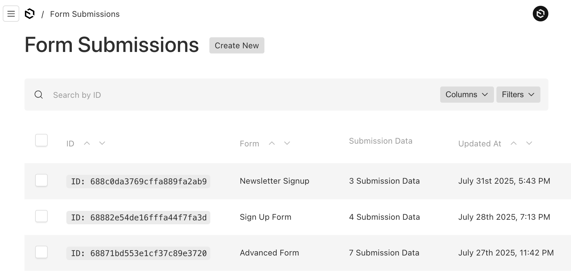
One thing to note, is that the Create New button may cause some confusion, since you cannot directly create new form submissions manually. It's intended for the form submissions to be added through the API using a POST.
In Conclusion
The Form Builder plugin definitely makes it really easy to add forms to your app. It provides the basic scaffolding to build any type of form such as:
- Basic forms
- Opt-in pages
- Polls
- Marketing funnels
- Multi-step forms using wizard steppers.
- Integrate with payment processing.
- and more...
After using the plugin for some time already, I'm finding so many creative ways to use it. The fact that you don't have to spend time building forms is a huge time saver.
I hope this has been helpful to step through the setup process of using the Form Builder plugin.