How Does Tailwind CSS Support Theming?

Tailwind CSS provides an extensive color palette out of the box for theming websites, however, it's also essential to consider a more design centered approach to theming your website.
By extending the default theme and applying some basic design principles, you'll be able to create a very flexible and design centered theme for your website.
In this article I'll cover some of the essential steps for theming with Tailwind, including:
- How to design a theme color palette.
- Create a theme that will support your brand.
- How to compose page level themes.
- How to apply component themes.
- How to use a theme for different validation or component states.
So on that note, let's dive in and learn how Tailwind CSS supports design based themes.
Designing a Theme Palette
Tailwind comes with a complete default color palette, which in most cases is enough to build any website, however if your project requires more specific branding and theming then it's best to create a simple brand based color palette.
Typically a design theme palette could come from one of the following:
- A design team.
- An existing design.
- A style guide.
- An existing website.
Most design teams and brands will identify with a few key color keys like:
- primary
- secondary
- accent / tertiary
- neutral
The key objective is to narrow it down to a few specific colors rather than using a wide range of random colors.
If you're just starting out and don't have any colors chosen yet, sometimes it's useful to use a color wheel to find colors that complement each other.
Defining a color theme in Tailwind CSS
All of the Tailwind CSS colors are defined in the tailwind.config.js file. To extend the default theme, simply add a customized colors object inside of the extend object and Tailwind will automatically merge it with the default theme.
By extending the base theme, all of the base color palettes from Tailwind's base theme will still be available to use.
tailwindcss config
export default {
theme: {
extend: {
colors: {
}
},
}
};
Defining a custom color palette
So here's some colors I'll use to create a custom design based theme palette.
tailwindcss config
export default {
theme: {
extend: {
colors: {
primary: '#0D65A3',
secondary: '#7d8ea1',
accent: '#f6bd08',
neutral: '#e9e7dd',
b1: '#ffffff',
b2: '#efefef',
b3: '#bdbdbd',
g1: '#FCFCFC',
g2: '#FAFAFA',
g3: '#F2F2F2',
info: '#0f8dc6',
success: '#7bc413',
warning: '#f8cf2b',
error: '#b01638',
}
},
},
};
Analyzing the new color palette
So this is a very basic example and sometimes usually all you may really need. Let's take a closer look at each color.
Main colors
primary: Primary dominant color.secondary: Secondary complementing color.accent: Alternative accent color, can also be called tertiary.neutral: A color that can neutrally blend with primary, secondary and accent colors.
Base colors
Base colors can be used for backgrounds, dropdown panels, borders or overlay components to name a few.
By defining a short list of base colors makes it easier to manage, rather than just using a full range color scale like gray-{100 - 900}.
Other default color palettes including gray or slate can still be used but using a base can keep your theme consistent across your app.
b1: base-100 can be white if needed or the base color in a dark mode theme.b2: base-200b3: base-300
Grayscale colors
Grayscale is optional but could be useful to keep a grayscale limited to certain shades.
g1: grayscale-100 lightest gray shade.g2: grayscale-200 medium gray shadeg3: grayscale-300 dark gray shade
Application state colors
State colors will help to ensure consistency for things like success messages or form error messages and other components.
It's better to have a central place for these values for the whole app to use, making it easier to manage down the road.
info: Information messagessuccess: Success messageswarning: Warning messageserror: Error messages
Keeping the theme color keys minimal, makes it easier to switch to new color shades as your app grows and designs change.
Sometimes, there can be seasonal design changes or experimental changes that can make it harder to swap colors when using random color shades throughout your app.
So as a rule of thumb, if some feature color is used across more than one page, it's probably better to assign a theme color value, otherwise it's probably fine to pick from a broader color palette.
Applying the theme palette
So now that a basic theme has been defined, we can actually start using it and see how it can be applied on a page.
Here's a few examples of applying Tailwind CSS utility classes on pages and components.
Applying theme classes on pages
For these examples, I'm creating some reusable CSS classes based on Tailwind utility classes to build buttons styles for primary, secondary and accent colors.
Typically these could be added inline at the class attribute level or set inside of a component.
Here's a more in-depth article on button variants using Tailwind CSS where I go into more detail on strategies for applying variants.
Themed pages and button examples
<style>
    .btn {
      @apply font-bold py-2 px-4 rounded;
    }
    .btn-primary {
      @apply bg-primary text-white;
    }
    .btn-primary:hover {
      @apply bg-primary/90;
    }

    .btn-secondary {
      @apply bg-secondary text-white;
    }
    .btn-secondary:hover {
      @apply bg-secondary/90;
    }

    .btn-accent {
      @apply bg-accent text-white;
    }
    .btn-accent:hover {
      @apply bg-accent/90;
    }
  </style>
  <header>
    <nav class="flex items-center justify-between bg-primary p-6">
      <div class="flex items-center flex-shrink-0 text-white mr-6">
        <span class="font-semibold text-xl tracking-tight">Design Agency</span>
      </div>
      <div class="w-full flex justify-between items-center">
        <div class="flex items-center space-x-3 text-sm">
          <a href="#responsive-header" class="text-accent hover:text-white">
            Docs
          </a>
          <a href="#responsive-header" class="text-accent hover:text-white">
            Examples
          </a>
          <a href="#responsive-header" class="text-accent hover:text-white">
            Blog
          </a>
        </div>
        <div class="flex items-center">
          <a
            href="#"
            class="inline-block text-sm px-4 py-2 leading-none border rounded text-white border-b1"
            >Sign-In</a
          >
        </div>
      </div>
    </nav>
  </header>
  <div class="bg-b2 flex-col justify-center p-5 screen">
    <h2 class="text-2xl font-bold mb-10">Custom Theme Demo</h2>
    <div class="flex-col space-y-10">
      <div>
        <button class="btn btn-primary">Primary</button>
        <button class="btn btn-secondary">Secondary</button>
        <button class="btn btn-accent">Accent</button>
      </div>
      <div class="flex space-x-10">
        <div>
          <div class="max-w-sm bg-white rounded overflow-hidden shadow-lg">
            <div class="px-6 py-4">
              <div class="font-bold text-2xl mb-2">Basic Plan</div>
              <p class="text-base">
                Lorem ipsum dolor sit amet, consectetur adipisicing elit.
                Voluptatibus quia, nulla! Maiores et perferendis eaque,
                exercitationem praesentium nihil.
              </p>
            </div>
            <div class="px-6 pt-4 pb-2">
              <span
                class="inline-block bg-b2 rounded-full px-3 py-1 text-sm font-semibold text-g-700 mr-2 mb-2"
                >#summer</span
              >
              <span
                class="inline-block bg-b2 rounded-full px-3 py-1 text-sm font-semibold text-g-700 mr-2 mb-2"
                >#vacation</span
              >
              <span
                class="inline-block bg-b2 rounded-full px-3 py-1 text-sm font-semibold text-g-700 mr-2 mb-2"
                >#food</span
              >
            </div>
          </div>
        </div>
        <div>
          <div class="max-w-sm bg-white rounded overflow-hidden shadow-lg">
            <div class="px-6 py-4">
              <div class="font-bold text-2xl mb-2">Premium Plan</div>
              <p class="text-base">
                Lorem ipsum dolor sit amet, consectetur adipisicing elit.
                Voluptatibus quia, nulla! Maiores et perferendis eaque,
                exercitationem praesentium nihil.
              </p>
            </div>
            <div class="flex justify-end px-6 pt-4 pb-2">
              <button class="btn btn-accent">Best Value</button>
            </div>
          </div>
        </div>
      </div>
    </div>
  </div>
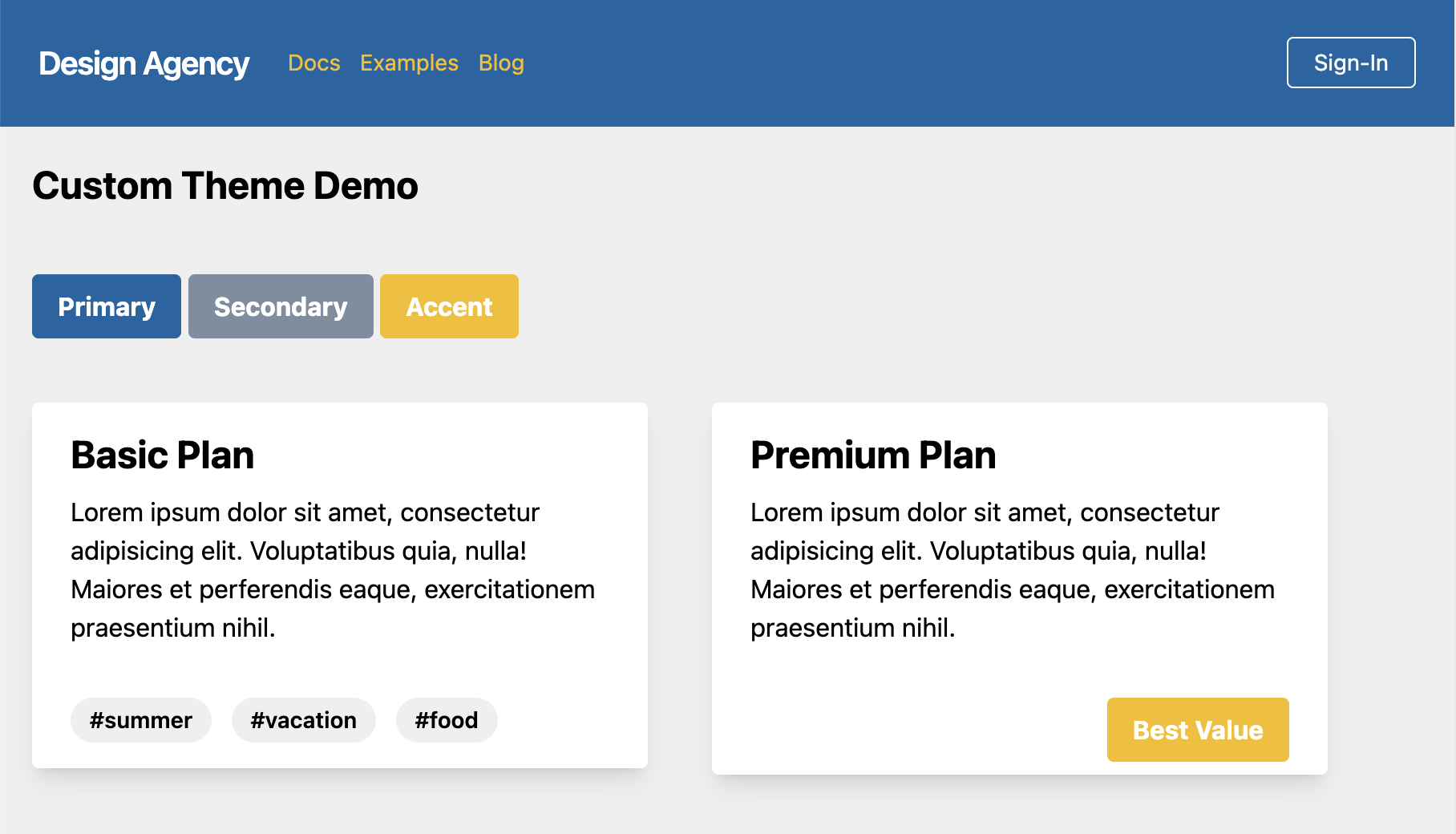
Here's what a page layout might look like using the new theme with a header nav which uses bg-primary and a base backdrop of bg-b2.
It definitely makes it easier to control key theme colors without too much variation on shades of colors. This allows for a consistent theme look and feel at the page level as well as components.
Themed alert messages
Let's take a look at how to style some components with different states.
The theme component state values can be added to create alert components based on different validation states.
Themed alert component examples
<style>
  .alert {
    @apply px-4 py-3 rounded relative;
  }

  .alert-success {
    @apply bg-success text-white;
  }

  .alert-info {
    @apply bg-info text-white;
  }

  .alert-warning {
    @apply bg-warning text-white;
  }

  .alert-error {
    @apply bg-error text-white;
  }
</style>

<div class="bg-b2 flex-col justify-center p-5 antialiased">
  <h2 class="text-2xl font-bold mb-10">Themed Alerts</h2>
  <div class="flex-col space-y-10">
    <div class="flex-col space-y-5">
      <div class="alert alert-success" role="alert">
        <strong class="font-bold">Success</strong>
        <span class="block sm:inline">Data was successfully updated.</span>
        <span class="absolute top-0 bottom-0 right-0 px-4 py-3">
          <svg
            class="fill-current h-6 w-6 text-white"
            role="button"
            xmlns="http://www.w3.org/2000/svg"
            viewBox="0 0 20 20"
          >
            <title>Close</title>
            <path
              d="M14.348 14.849a1.2 1.2 0 0 1-1.697 0L10 11.819l-2.651 3.029a1.2 1.2 0 1 1-1.697-1.697l2.758-3.15-2.759-3.152a1.2 1.2 0 1 1 1.697-1.697L10 8.183l2.651-3.031a1.2 1.2 0 1 1 1.697 1.697l-2.758 3.152 2.758 3.15a1.2 1.2 0 0 1 0 1.698z"
            ></path>
          </svg>
        </span>
      </div>

      <div class="alert alert-info" role="alert">
        <strong class="font-bold">Info</strong>
        <span class="block sm:inline">Just a simple informative message.</span>
        <span class="absolute top-0 bottom-0 right-0 px-4 py-3">
          <svg
            class="fill-current h-6 w-6 text-white"
            role="button"
            xmlns="http://www.w3.org/2000/svg"
            viewBox="0 0 20 20"
          >
            <title>Close</title>
            <path
              d="M14.348 14.849a1.2 1.2 0 0 1-1.697 0L10 11.819l-2.651 3.029a1.2 1.2 0 1 1-1.697-1.697l2.758-3.15-2.759-3.152a1.2 1.2 0 1 1 1.697-1.697L10 8.183l2.651-3.031a1.2 1.2 0 1 1 1.697 1.697l-2.758 3.152 2.758 3.15a1.2 1.2 0 0 1 0 1.698z"
            ></path>
          </svg>
        </span>
      </div>

      <div class="alert alert-warning" role="alert">
        <strong class="font-bold">Warning</strong>
        <span class="block sm:inline">Your memory is low.</span>
        <span class="absolute top-0 bottom-0 right-0 px-4 py-3">
          <svg
            class="fill-current h-6 w-6 text-white"
            role="button"
            xmlns="http://www.w3.org/2000/svg"
            viewBox="0 0 20 20"
          >
            <title>Close</title>
            <path
              d="M14.348 14.849a1.2 1.2 0 0 1-1.697 0L10 11.819l-2.651 3.029a1.2 1.2 0 1 1-1.697-1.697l2.758-3.15-2.759-3.152a1.2 1.2 0 1 1 1.697-1.697L10 8.183l2.651-3.031a1.2 1.2 0 1 1 1.697 1.697l-2.758 3.152 2.758 3.15a1.2 1.2 0 0 1 0 1.698z"
            ></path>
          </svg>
        </span>
      </div>

      <div class="alert alert-error" role="alert">
        <strong class="font-bold">Error!</strong>
        <span class="block sm:inline">Something has failed.</span>
        <span class="absolute top-0 bottom-0 right-0 px-4 py-3">
          <svg
            class="fill-current h-6 w-6 text-white"
            role="button"
            xmlns="http://www.w3.org/2000/svg"
            viewBox="0 0 20 20"
          >
            <title>Close</title>
            <path
              d="M14.348 14.849a1.2 1.2 0 0 1-1.697 0L10 11.819l-2.651 3.029a1.2 1.2 0 1 1-1.697-1.697l2.758-3.15-2.759-3.152a1.2 1.2 0 1 1 1.697-1.697L10 8.183l2.651-3.031a1.2 1.2 0 1 1 1.697 1.697l-2.758 3.152 2.758 3.15a1.2 1.2 0 0 1 0 1.698z"
            ></path>
          </svg>
        </span>
      </div>
    </div>
  </div>
</div>
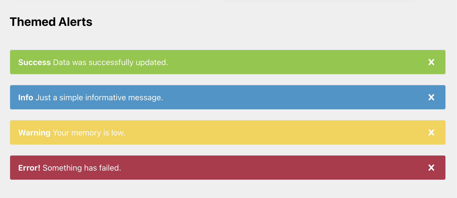
Here's what the rendered components would look like using the state theme utility classes.
Lastly, let's take a look at another example using the new theme on form elements to apply validation state.
For a more information on using @tailwindcss/forms forms plugin, here's a link to an article where I go into more detail on using Tailwind CSS to style form inputs
Themed form input field examples
<style>
  .form-input {
    @apply appearance-none bg-white border-b3 rounded-md px-3 py-2 text-base border-2 border-b3  focus:outline-b3 focus:ring-2 focus:ring-offset-2 focus:ring-b3;
  }

  .form-input-success {
    @apply border-success focus:text-success focus:border-success focus:outline-success focus:ring-success;
  }
  .form-input-error {
    @apply border-error focus:text-error focus:border-error focus:outline-error focus:ring-error;
  }
</style>

<div class="bg-b1 flex-col justify-center p-5 antialiased">
  <form>
    <h2 class="text-2xl font-bold mb-10">Themed Forms</h2>
    <div class="grid grid-cols-1 sm:grid-cols-12 gap-6">
      <div class="flex-col sm:col-span-8 space-y-3">
        <label class="block">Default Input</label>
        <input
          type="text"
          class="form-input w-full max-w-xs"
          placeholder="Enter some text..."
        />
      </div>
      <div class="flex-col sm:col-span-8 space-y-3">
        <label class="block">Success Input</label>
        <input
          type="text"
          class="form-input form-input-success w-full max-w-xs"
          placeholder="Enter some text..."
        />
      </div>
      <div class="flex-col sm:col-span-8 space-y-3">
        <label class="block">Error Input</label>
        <input
          type="email"
          class="form-input form-input-error w-full max-w-xs"
          placeholder="lloyd@example.com"
        />
      </div>

      <div class="col-span-full flex justify-end items-center space-x-2">
        <button type="submit" class="btn btn-primary">Submit</button>
        <button class="btn btn-secondary">Cancel</button>
      </div>
    </div>
  </form>
</div>
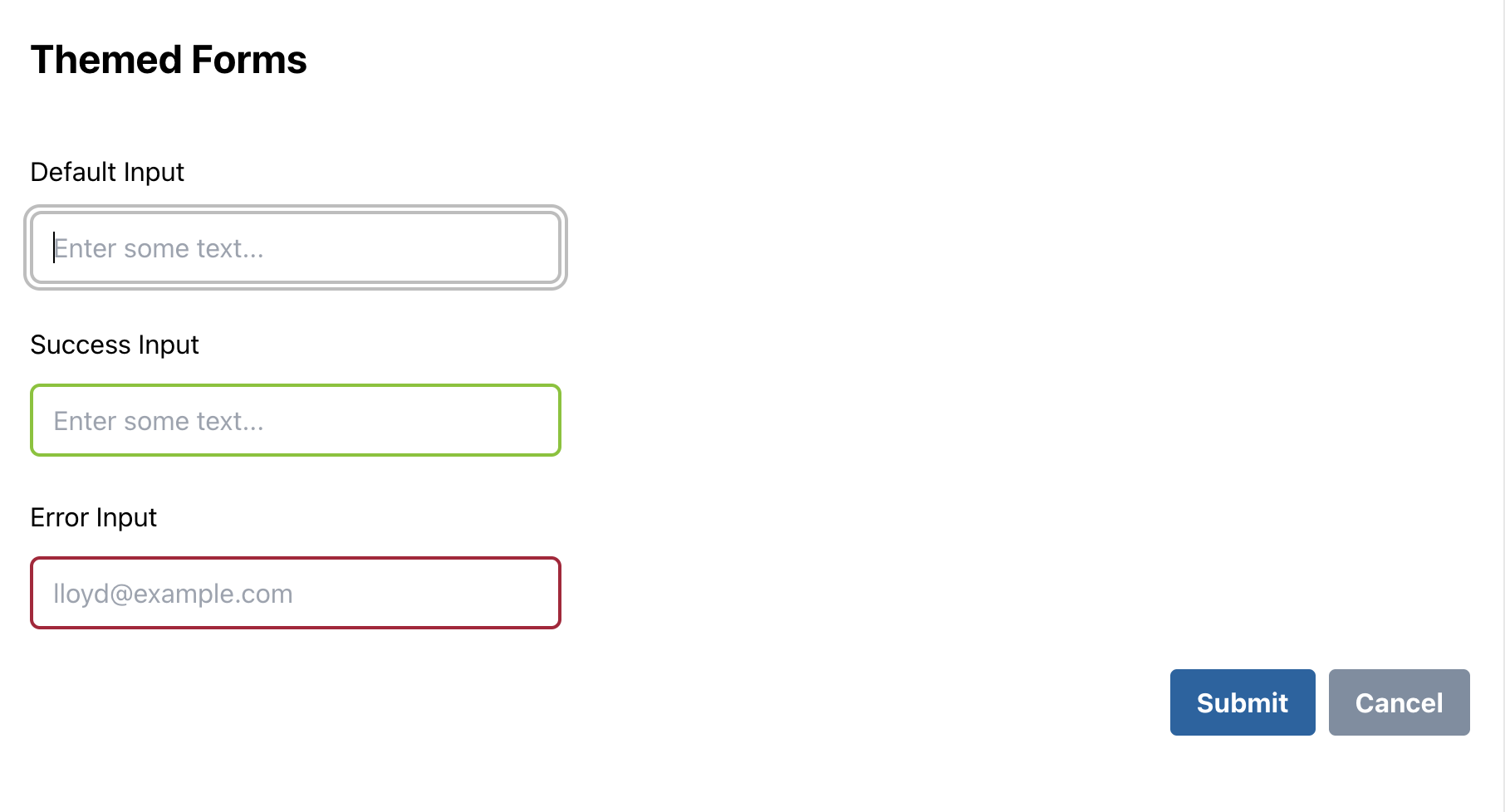
Here's the rendered output with different states for each form input field.
In Conclusion
So we've seen how to create a simple theme in Tailwind rather than relying only on the default color palettes. It's good to have options on shades of color but creating a customized theme with design awareness in mind can have huge advantages in the long run.
You'll probably find the need to add and modify it based on your needs but essentially the concept should remain the same.
Tailwind definitley makes it easy to create design based themes without having to modify or override teadius levels of CSS.
Hope this article was informative.